These three latest visualizations generated with the Claude GlyphViz Skil for GlyphViz are great examples of what is possible with just a good prompt and a capable model.


These were generated using Opus 5. Please explore.
Explorations Into Perceptual Cybernetics
These three latest visualizations generated with the Claude GlyphViz Skil for GlyphViz are great examples of what is possible with just a good prompt and a capable model.
These were generated using Opus 5. Please explore.

I am very excited to release version 1 of GlyphViz and its web counterpart, GlyphVizWeb. They both offer new ways of visualizing complex data, creating compelling scientific animations, and generating visualizations of real-time streaming data such as RSS Feeds and Satellite orbiting data. The interface makes it easy to download examples in zip format and simply drag-and-drop onto either the desktop or browser versions. Please explore and let me know what you think by sending me a message to contact ‘at’ iluvdata.org.
Learn more and explore the desktop or web versions, GlyphViz or GlyphVizWeb.
Check out my new improved fractal drawing program, with lots of cool features including playback, wind effects, mountains, and lots more!


I harvested the accounts of all 475 of my Followers on Twitter with the Twitter API v2 and generated timeline tower visualizations with ANTz of a few of my most-followed Followers just for fun. The diversity of tweeting behavior in just this small subset is a pleasant surprise. I can’t wait to do more.


About the Visualization Methods
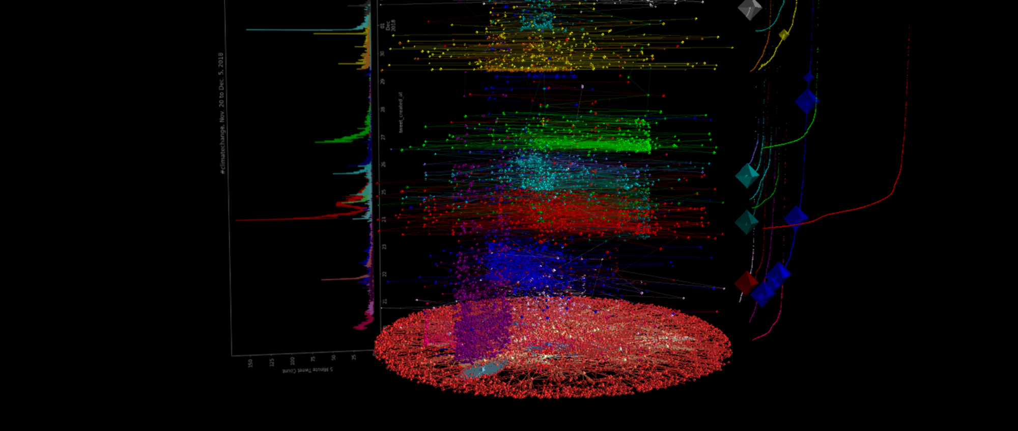
These are a repertoire of data visualization methods applied to a dataset of tweets containing the hashtag ‘climatechange’ collected during a period from November 20 to December 5, 2018. Methods include a network graph visualization of the entire dataset, frequency count plots of the top 20 tweets (i.e. the tweets with the most retweets), temporal scatter plots showing the lifespan of a tweet with scatter dot size representing follower counts which help shed light on how a user with a high number of followers can ‘resurrect’ the life of a tweet, and 3D data visualization of the same methods combined into a single interactive viz using the ANTz 3D data viz program.
View more visualizations here.


This dataset was collected from November 20 to December 5, 2018, with the Twitter API using the streaming search option to gather tweets and retweets which used the hashtag #climatechange. There are 457,294 tweets and retweets. There are 138,305 original tweets and 318,989 retweets.
I developed a drawing program in JavaScript and the HTML5 canvas element which was initially intended to draw fractal trees and to create artsy fractal forests. It has since expanded to include other geometric patterns and I have added some presets to highlight some of the more interesting capabilities. please drop me a line on Twitter with feedback if you are so inclined.
https://iluvdata.org/fractal_drawing/index.php


This is an attempt at visualizing the entire GTD in a single visualization, or subsets thereof, using hyperglyphs to help provide visual summaries of terrorist group behavior graphically associated with their sites of attack.
This data is courtesy of the Global Terrorism Database. Visit the GTD.

These are some examples of visualization work I did* in an effort to gain insight into disinformation campaigns and twitter bot behavior.
https://www.iluvdata.org/twitter/disinfo/summary.html


*This work was funded by the Office of Naval Research (Grant N-00014-18-1-2012). Thanks to co-PIs Jen Zeimke and Kate Starbird, with additional acknowledgement to Dave Warner, Robert Alexander, Peter Raymond, Mike Winters, and the rest of the team who made such important contributions. Hat tip to Shane Saxon, developer of the ANTz visualization tool.


