Twitter Data Viz - #climatechange
About the #climatechange dataset
This dataset was collected from November 20 to December 5, 2018, with the Twitter API using the streaming search option to gather tweets and retweets which used the hashtag #climatechange. There are 457,294 tweets and retweets. There are 138,305 original tweets and 318,989 retweets.
The data was gathered using a python script to search by the hashtag #climatechange. Download the script.
Download a reduced form of the data in CSV format or PKL format.
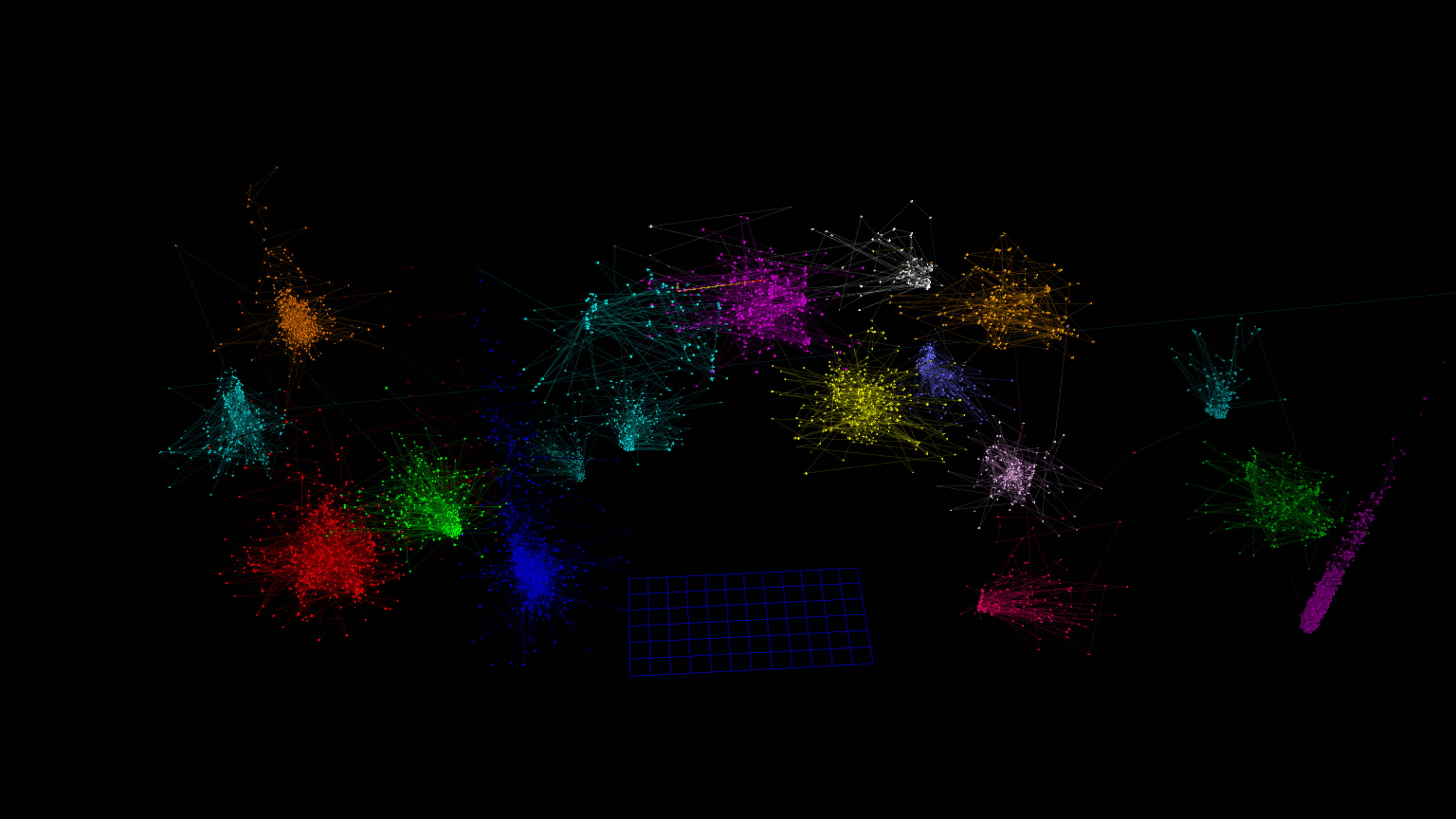
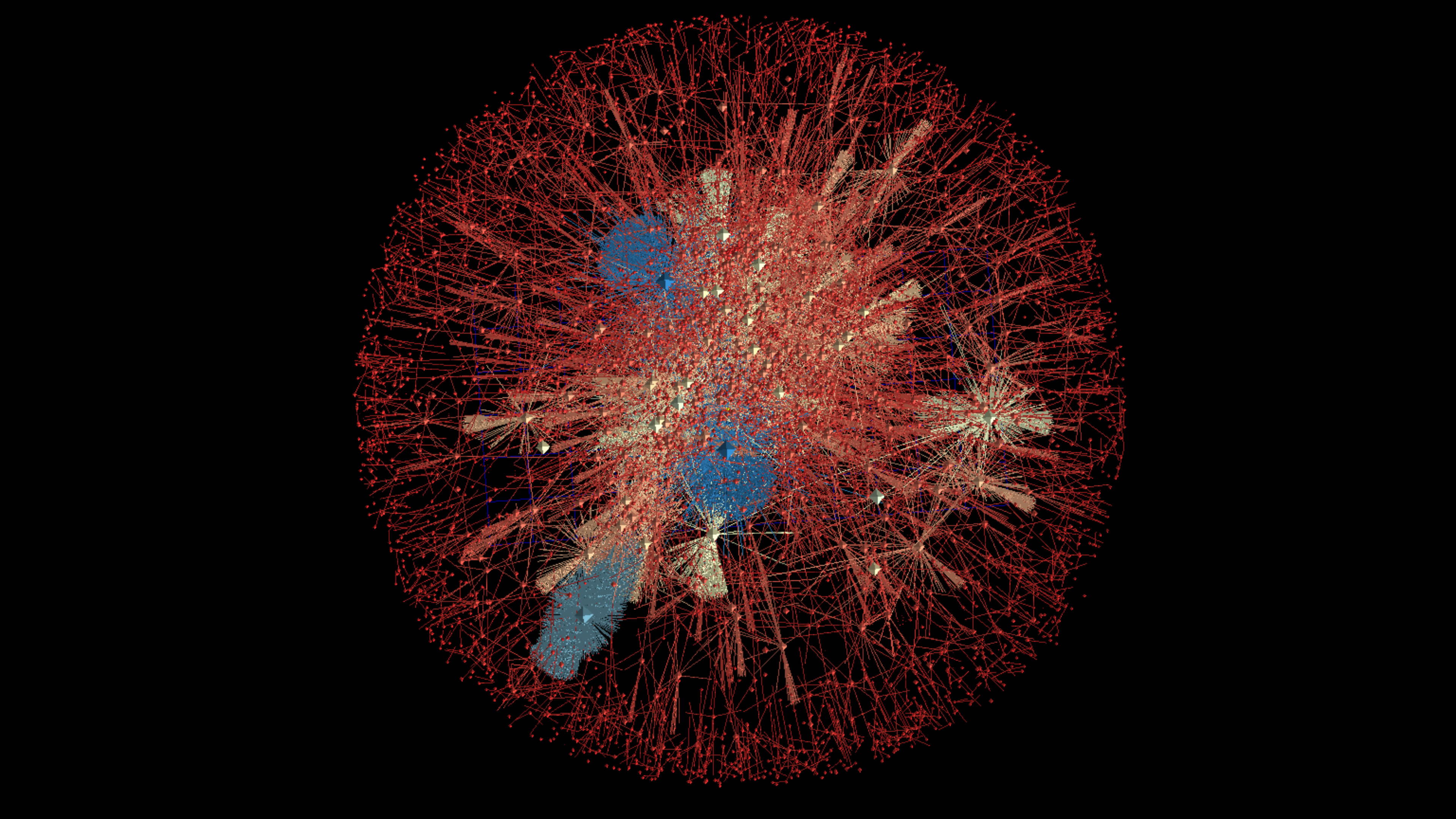
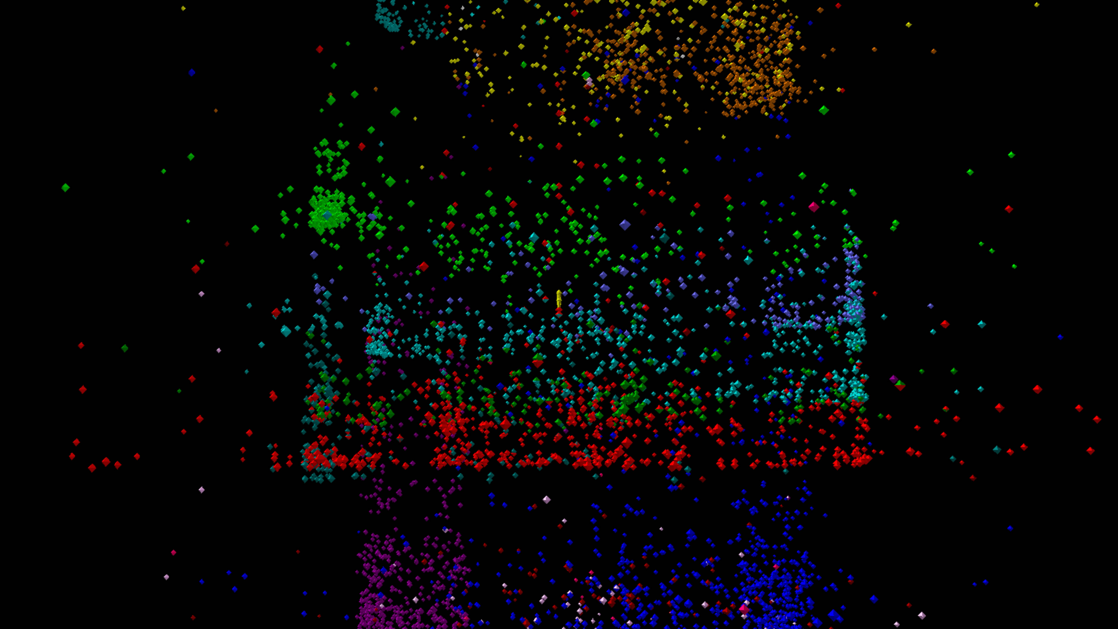
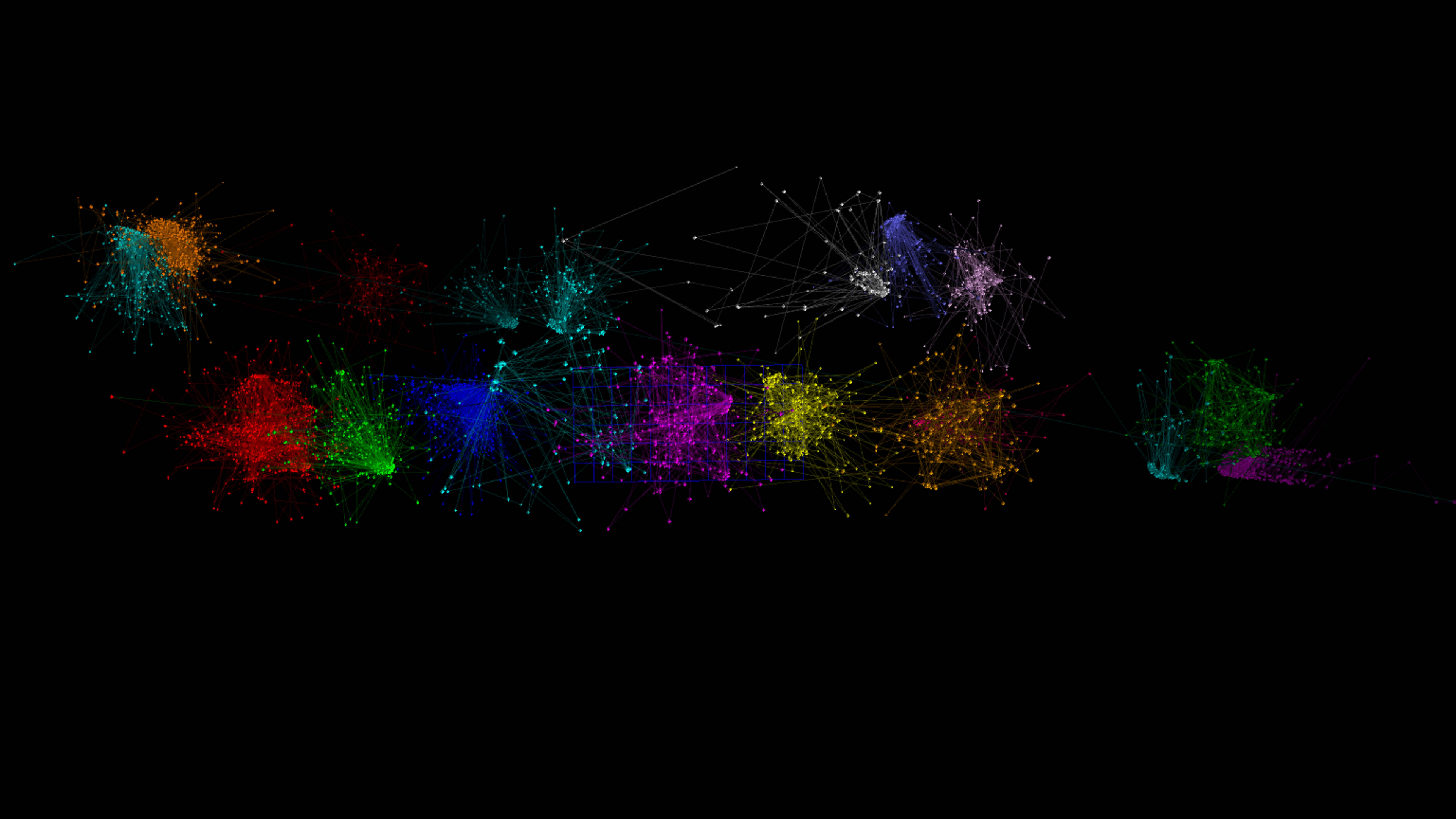
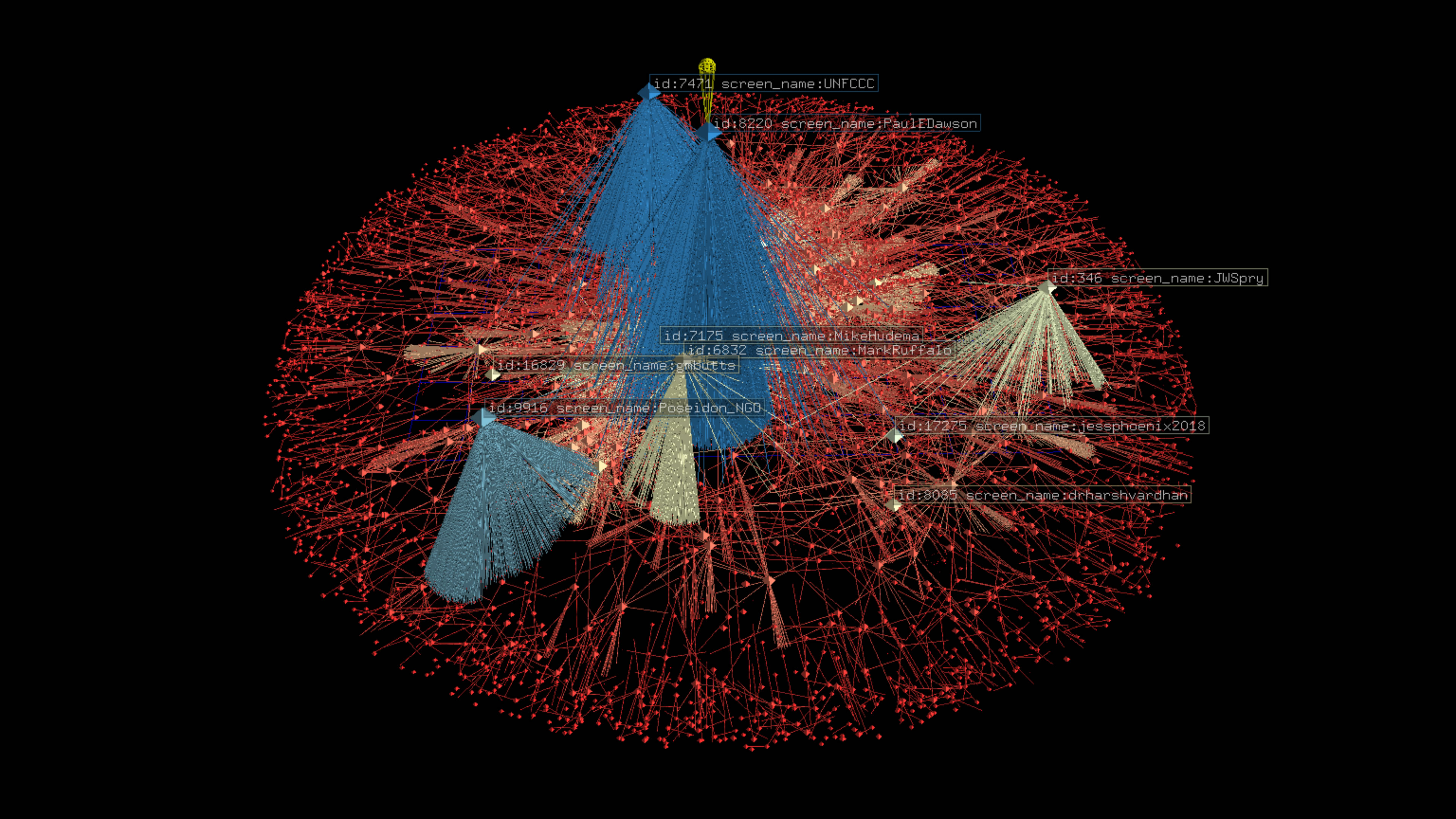
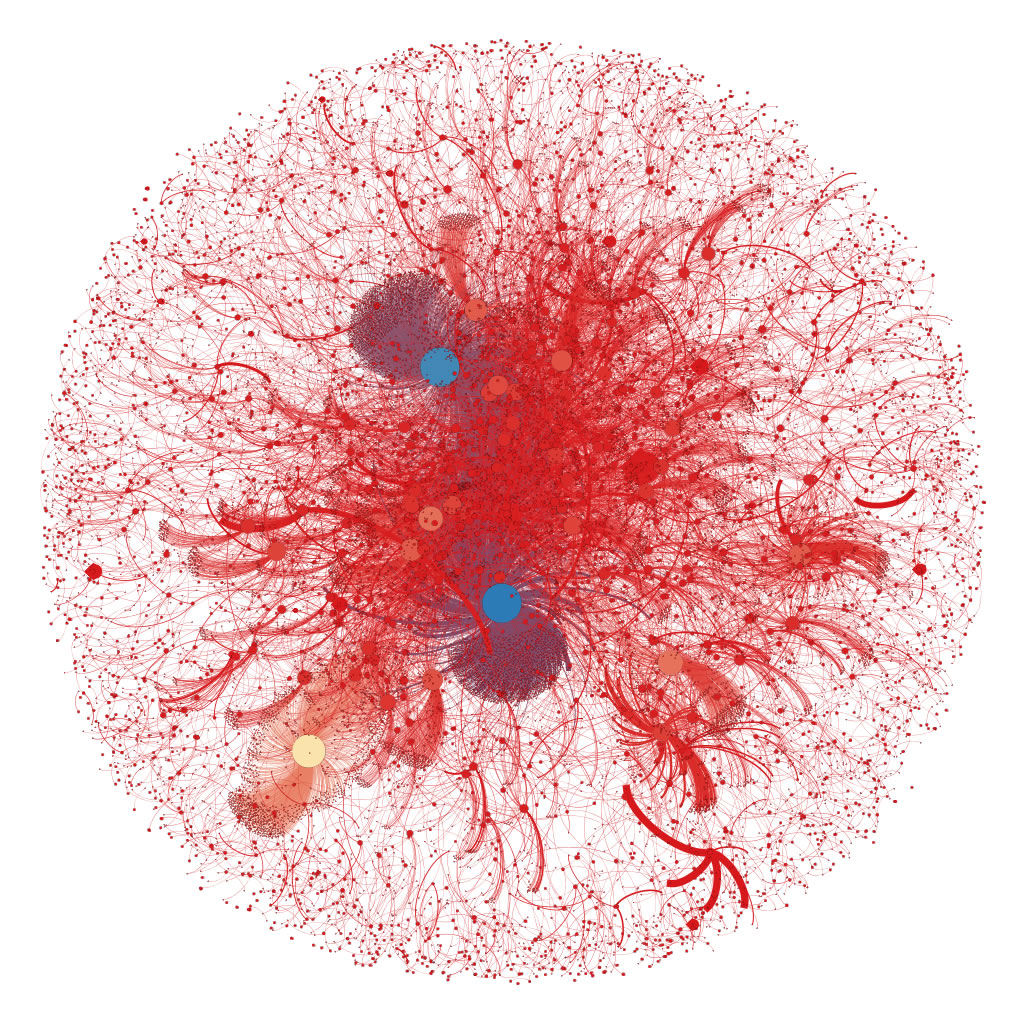
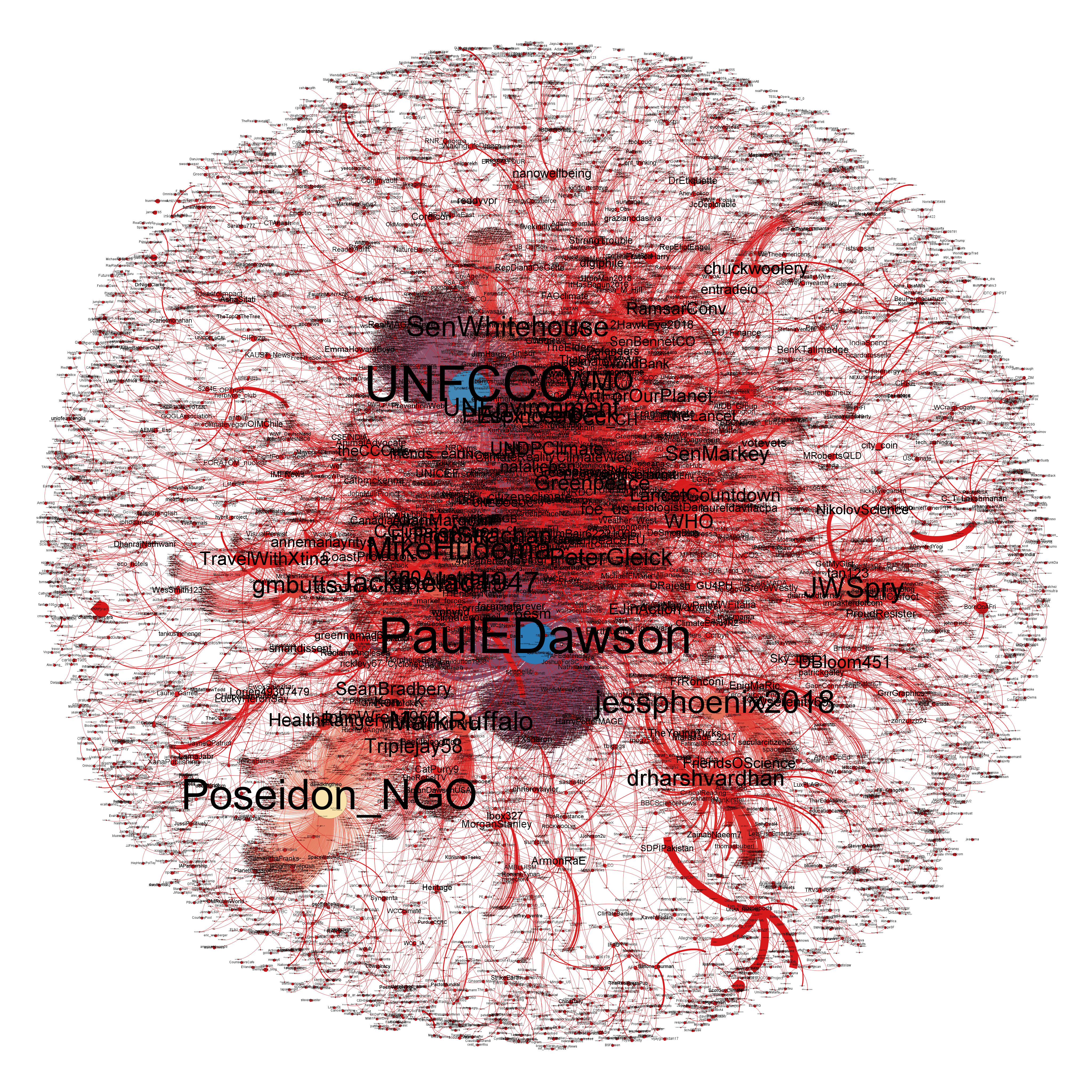
Below are two graphs. The first is a graph network of Twitter users with connections to 2 or more other users who tweeted or retweeted tweets in the dataset without labels. The second is a much higher resolution JPG which includes labels.
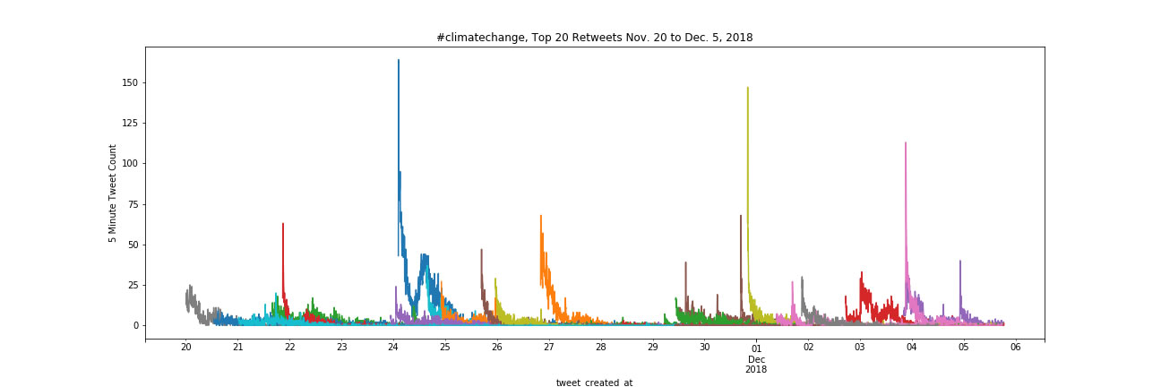
Top 20 Tweet Frequency Counts
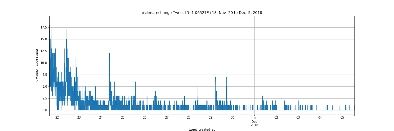
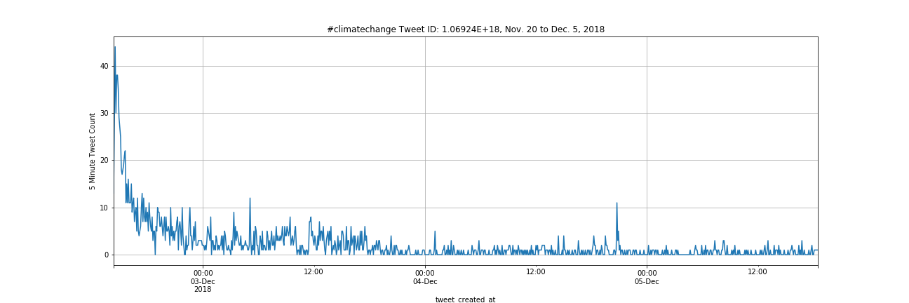
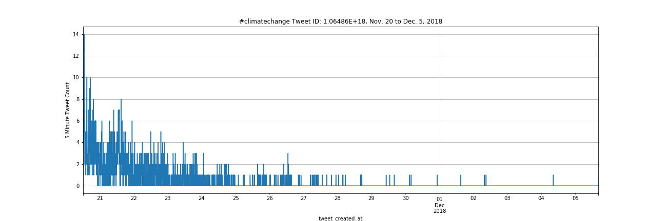
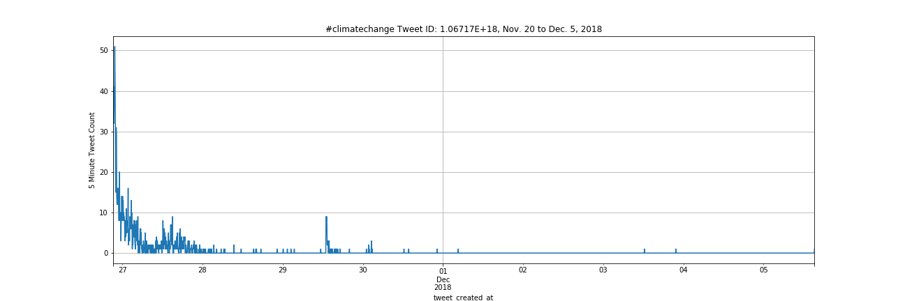
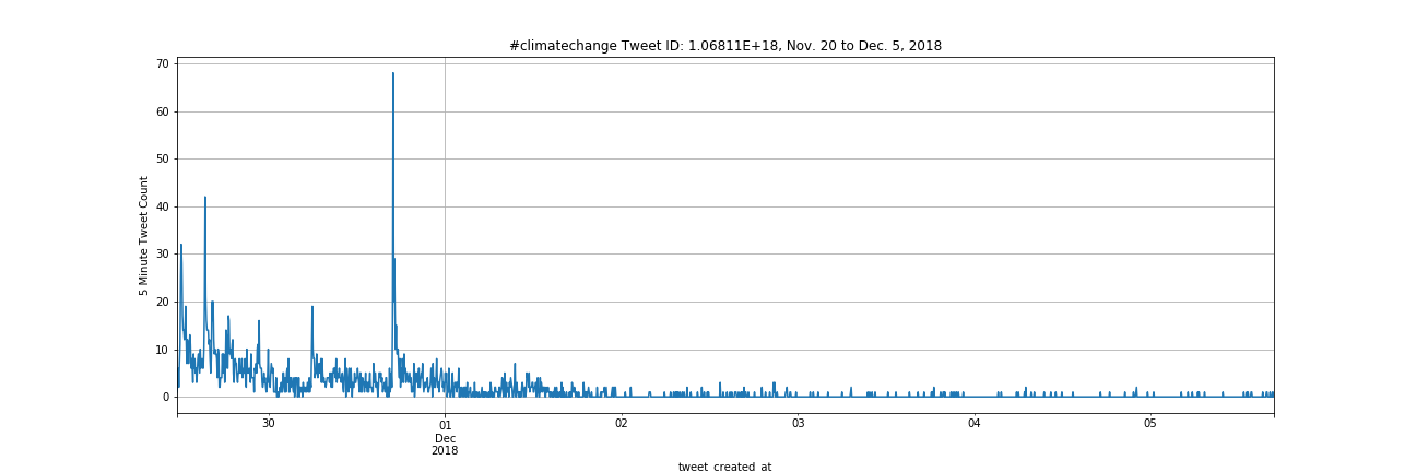
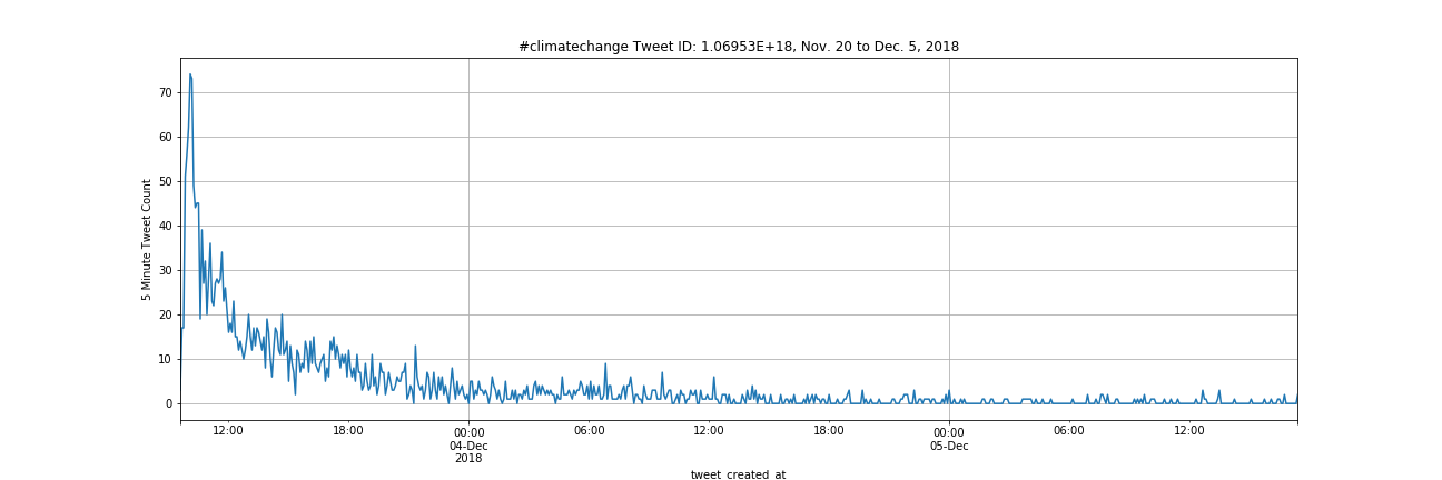
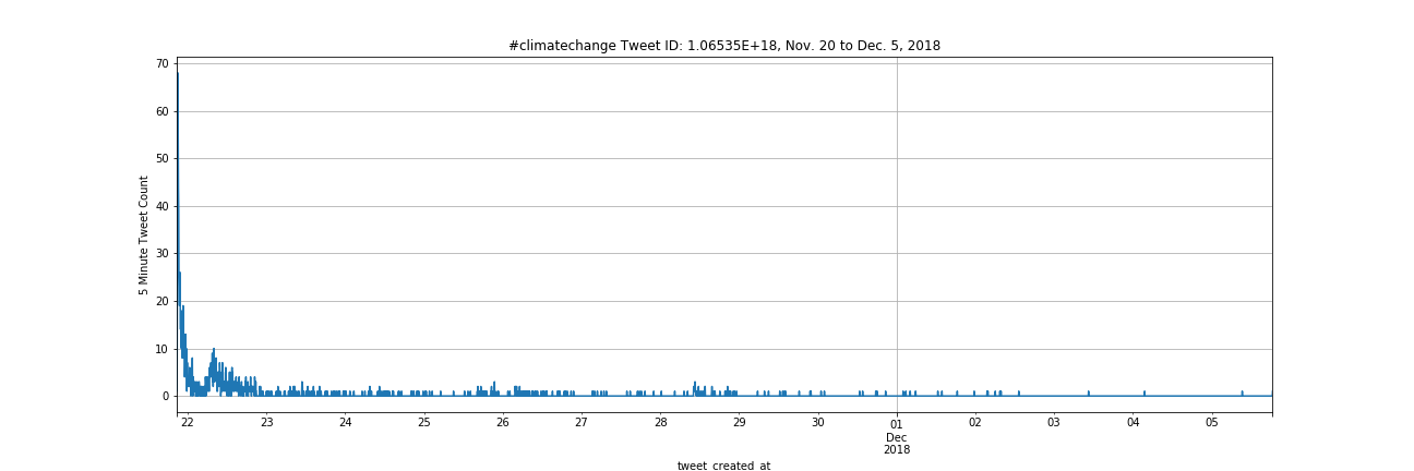
The image below is a plot of 5 min frequency counts for tweets containing #climatechange from November 20 to December 5. During this time there was a COP18 meeting globally of key countries involved in climate change mitigation strategies.
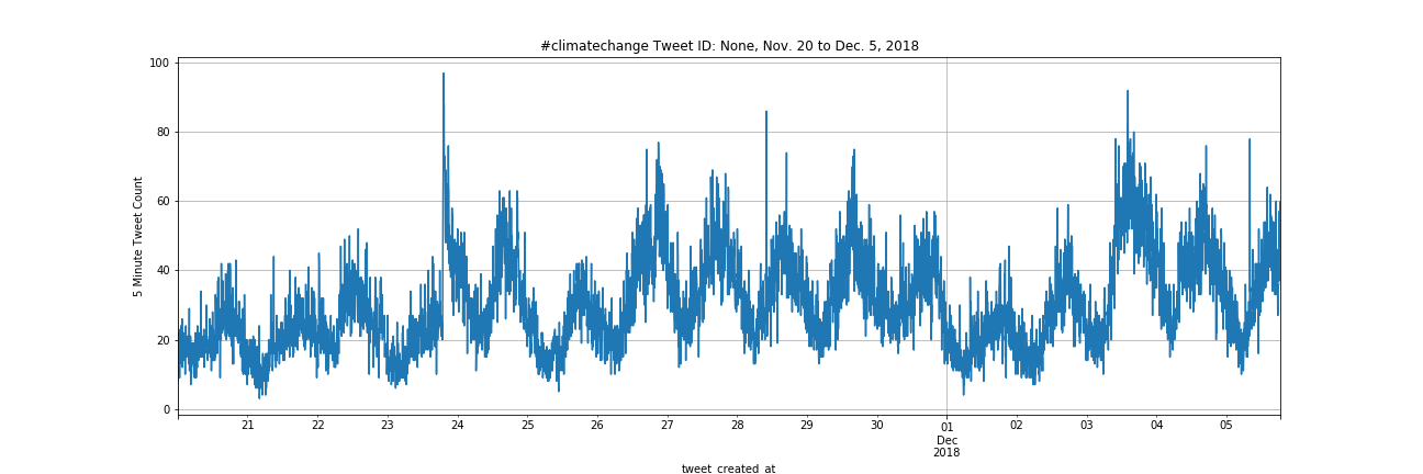
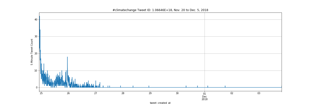
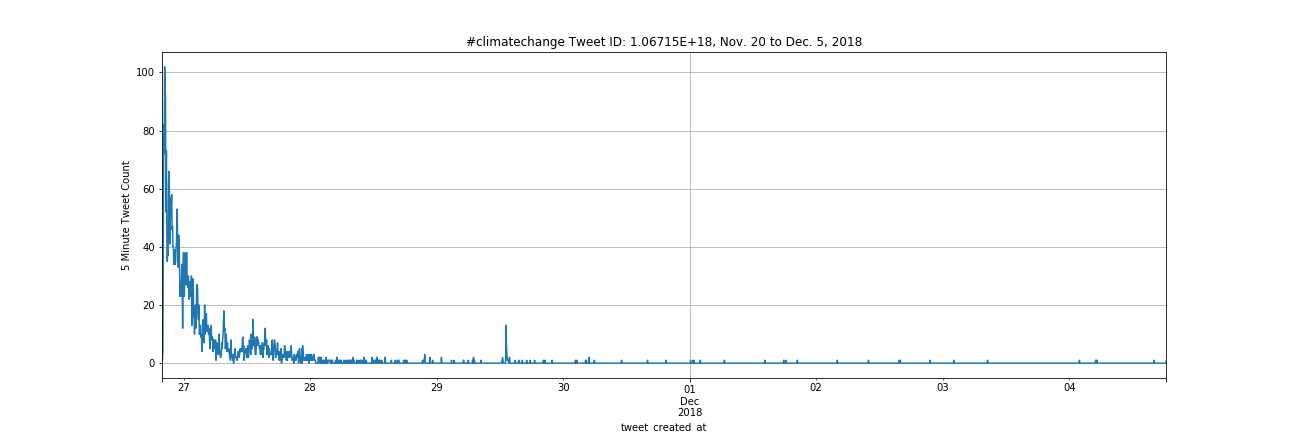
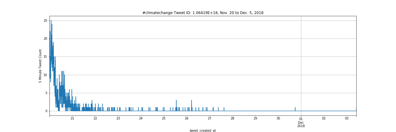
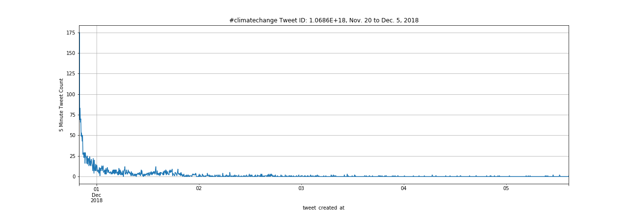
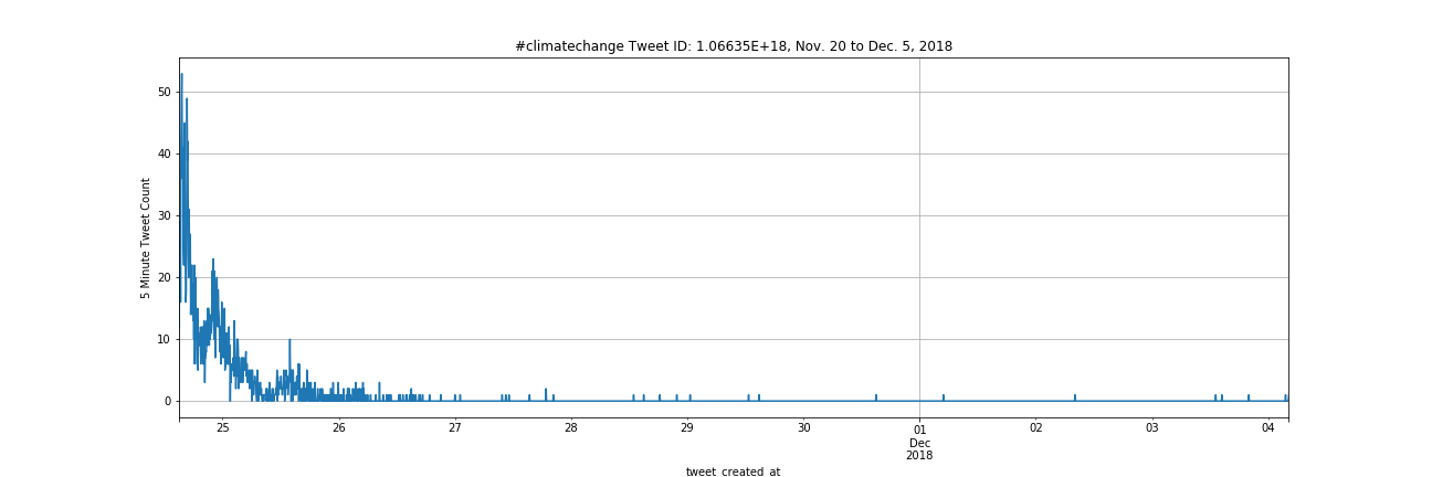
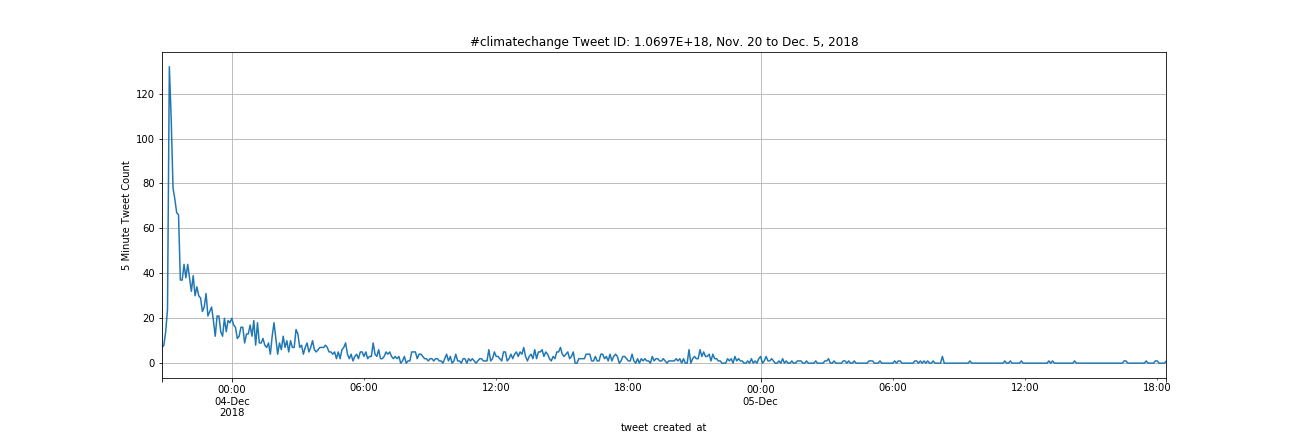
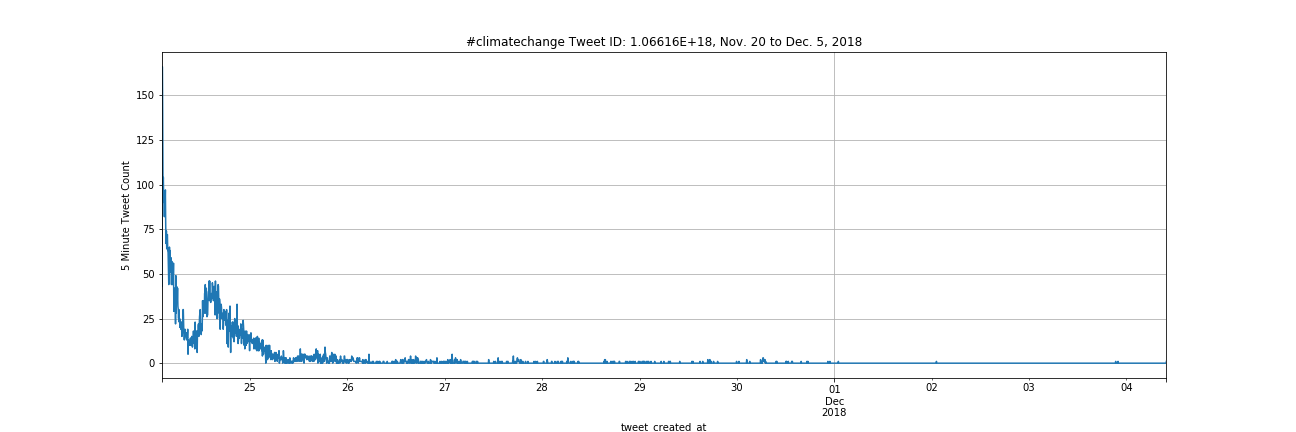
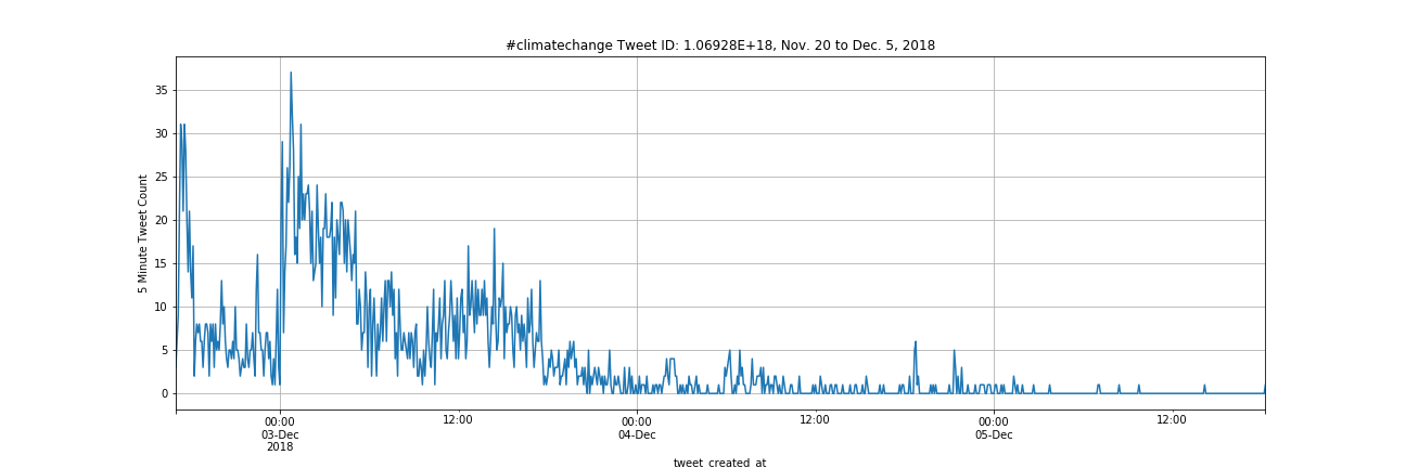
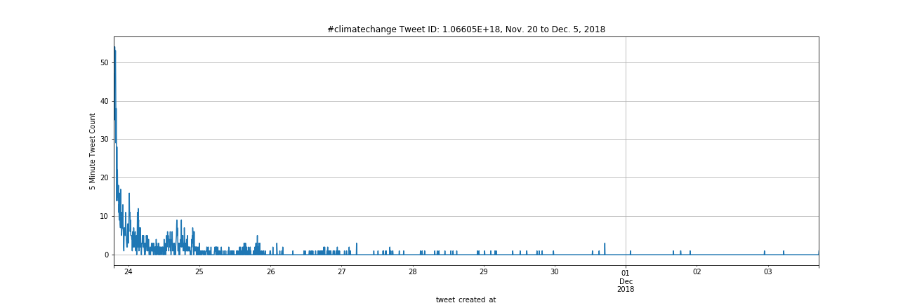
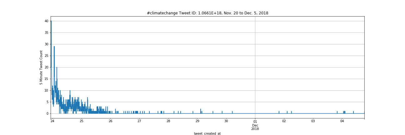
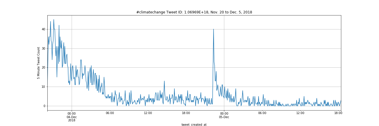
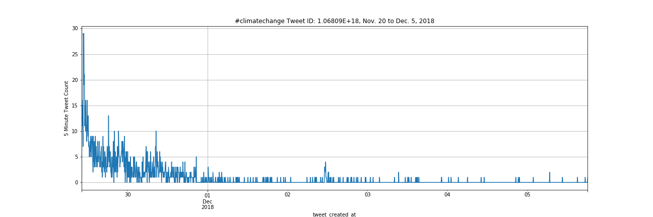
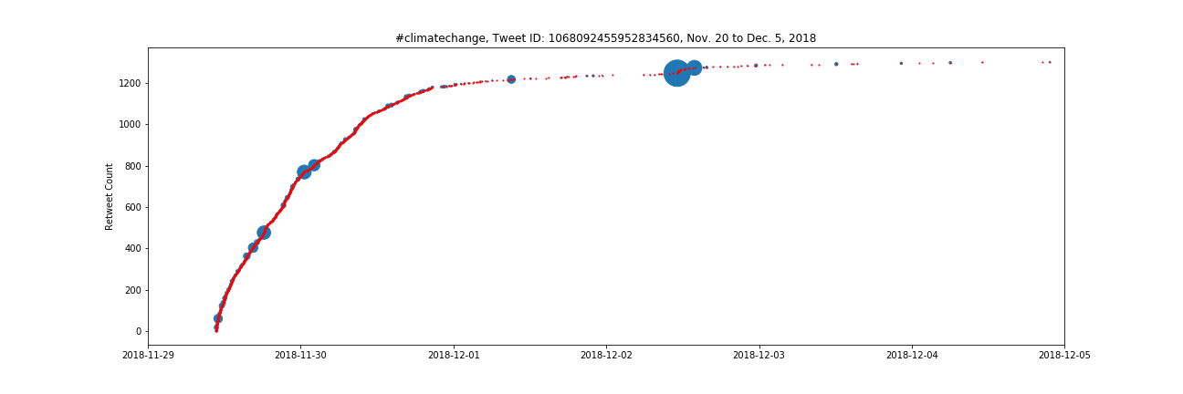
The image below is a cumulative frequency plot of all tweets containing #climatechange from November 20 to December 5. Below that are the frequency plots of the top 20 individual tweets for the dataset.
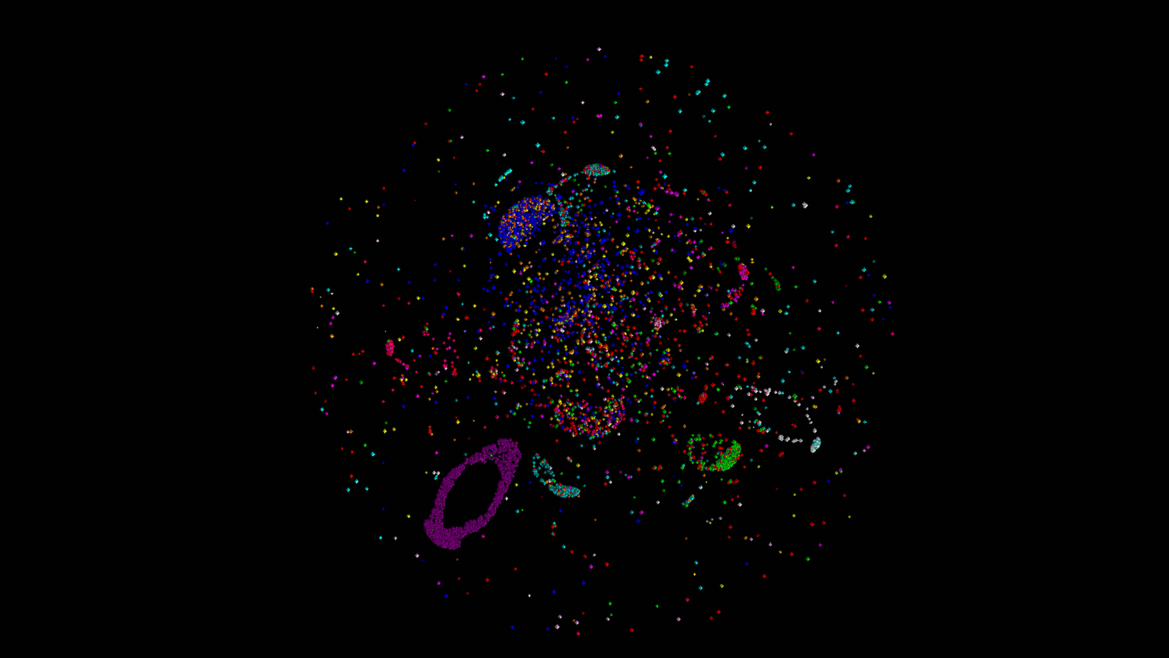
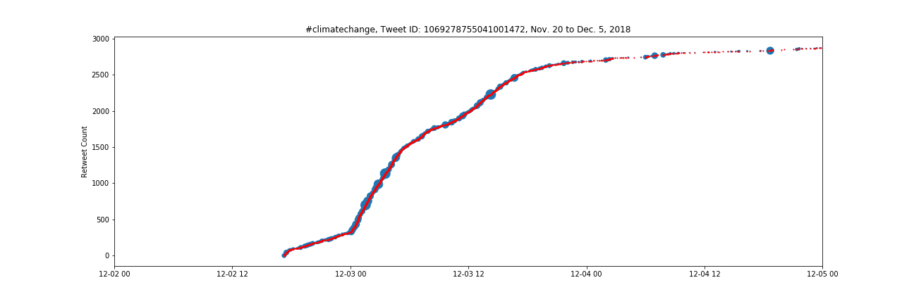
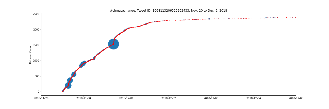
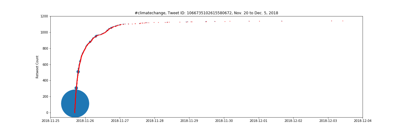
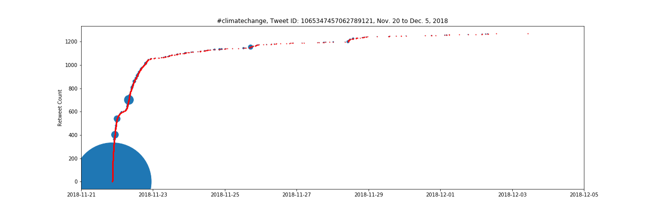
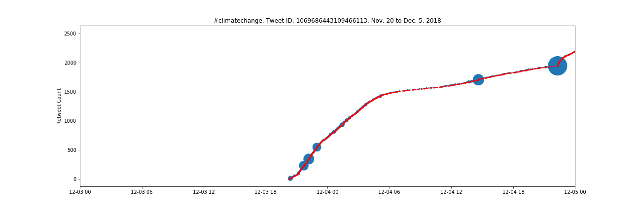
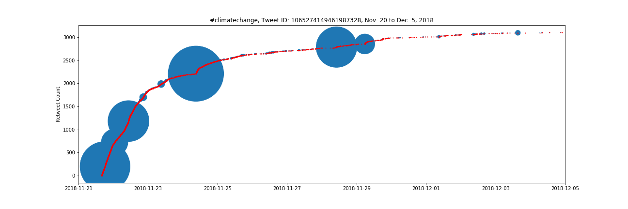
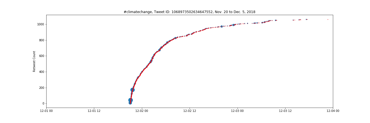
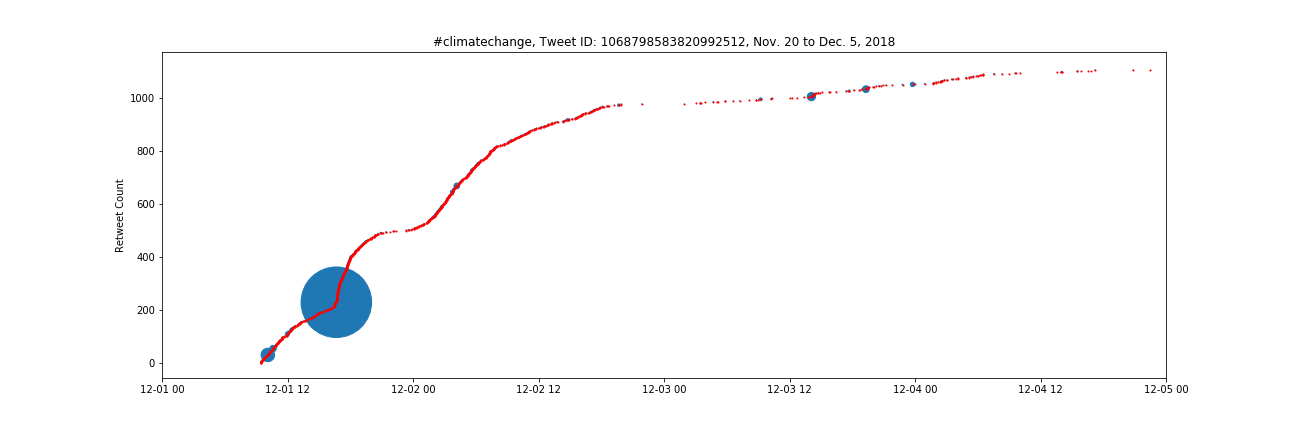
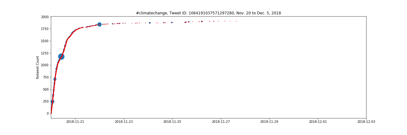
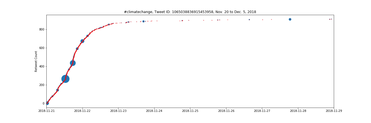
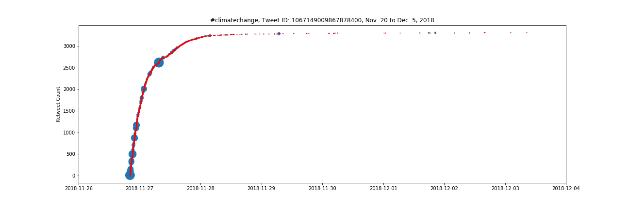
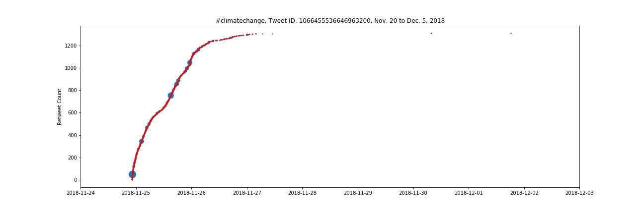
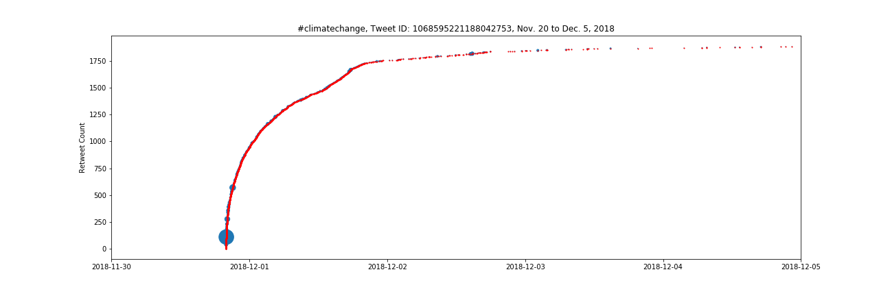
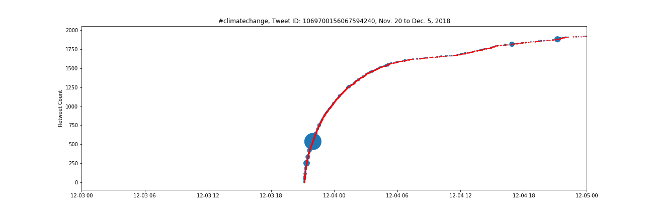
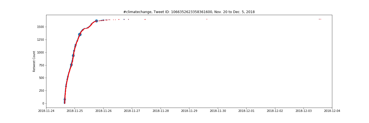
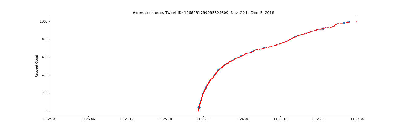
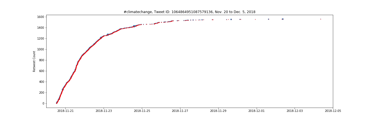
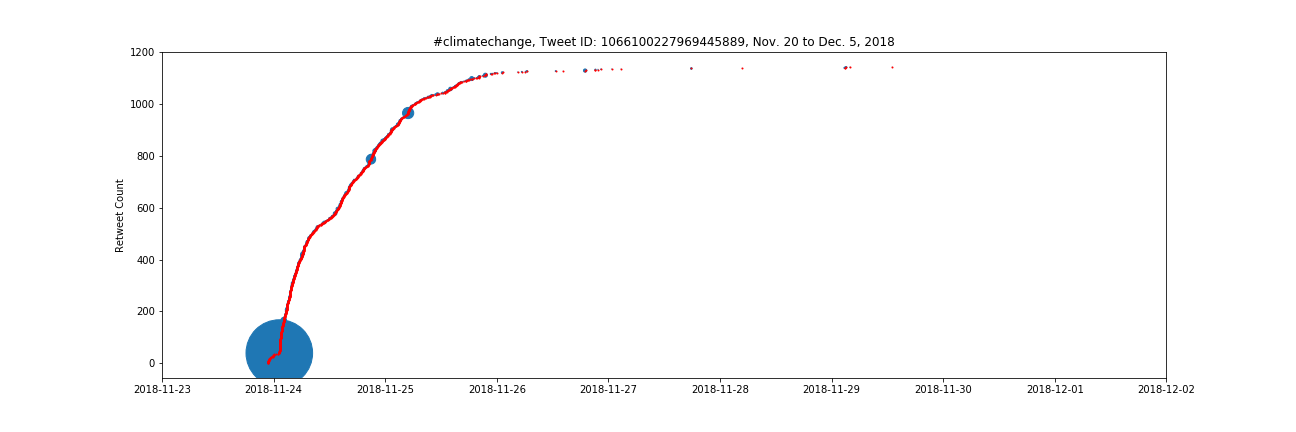
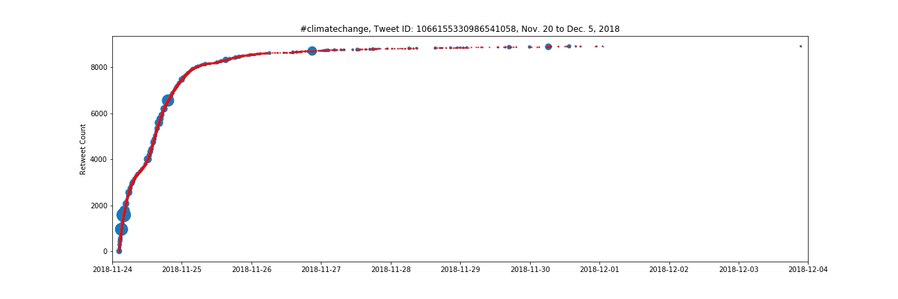
Top 20 Tweet Combined Temporal Scatter Plots
Temporal scatter plots are a unique and useful method for illustrating the lifespan of a tweet and its retweets. Time goes from left to right and the tweet count is vertical, in which each new retweet increments the plot one unit vertically at a time. Dots are scaled and colored blue to represent the follower count of the Twitter user who retweeted that tweet.
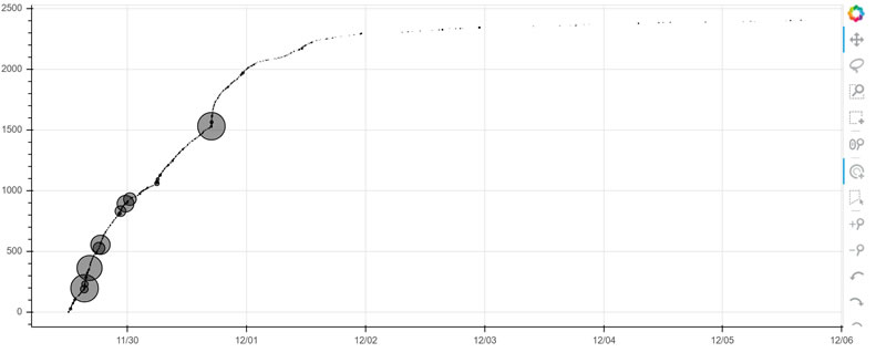
Interactive Bokeh Plot of Temporal Scatter Plot
Click the image below to explore an interactive plot showing a tweet lifespan with dot size representing the Twitter user follower counts. Note the sudden increase in retweets when a user with a high follower count retweets the tweet. Bokeh is an awesome plotting program which providers interactivity with the data, including pan/zoom and metadata viewable with a hover of the mouse cursor.
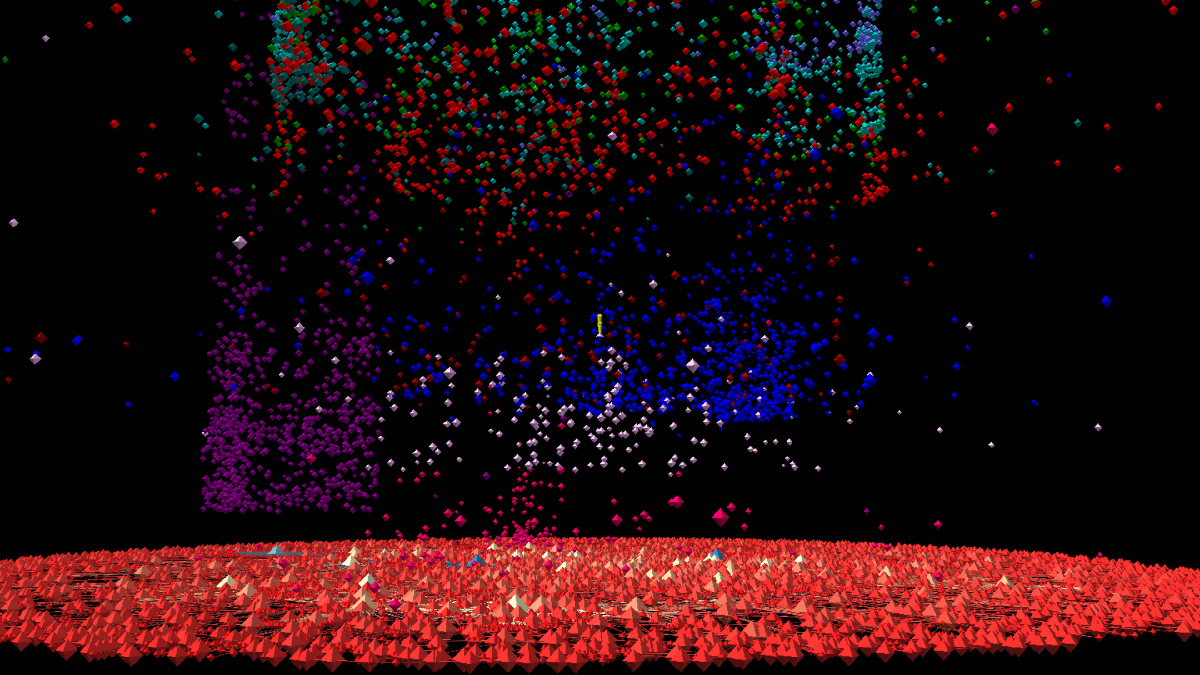
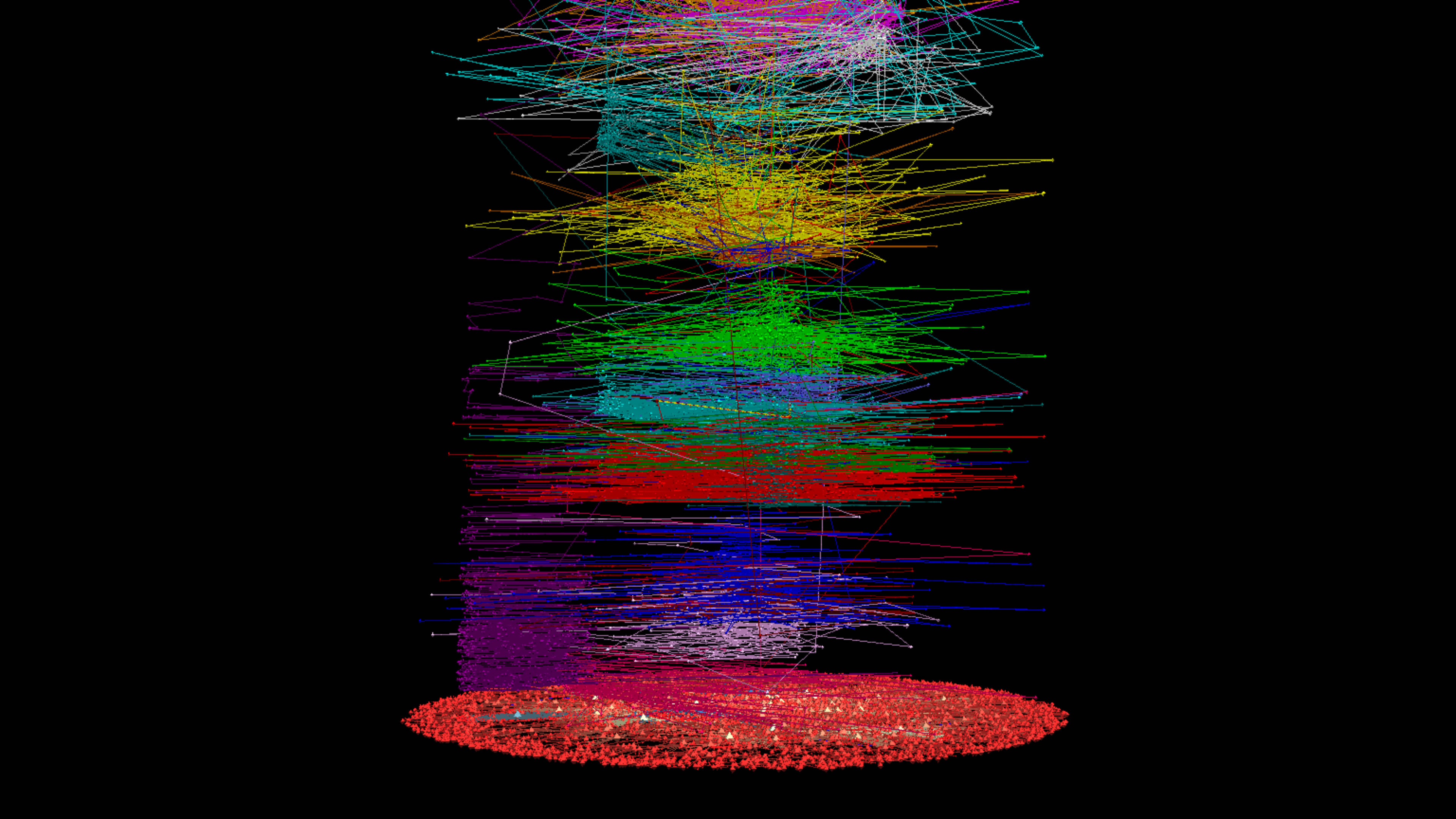
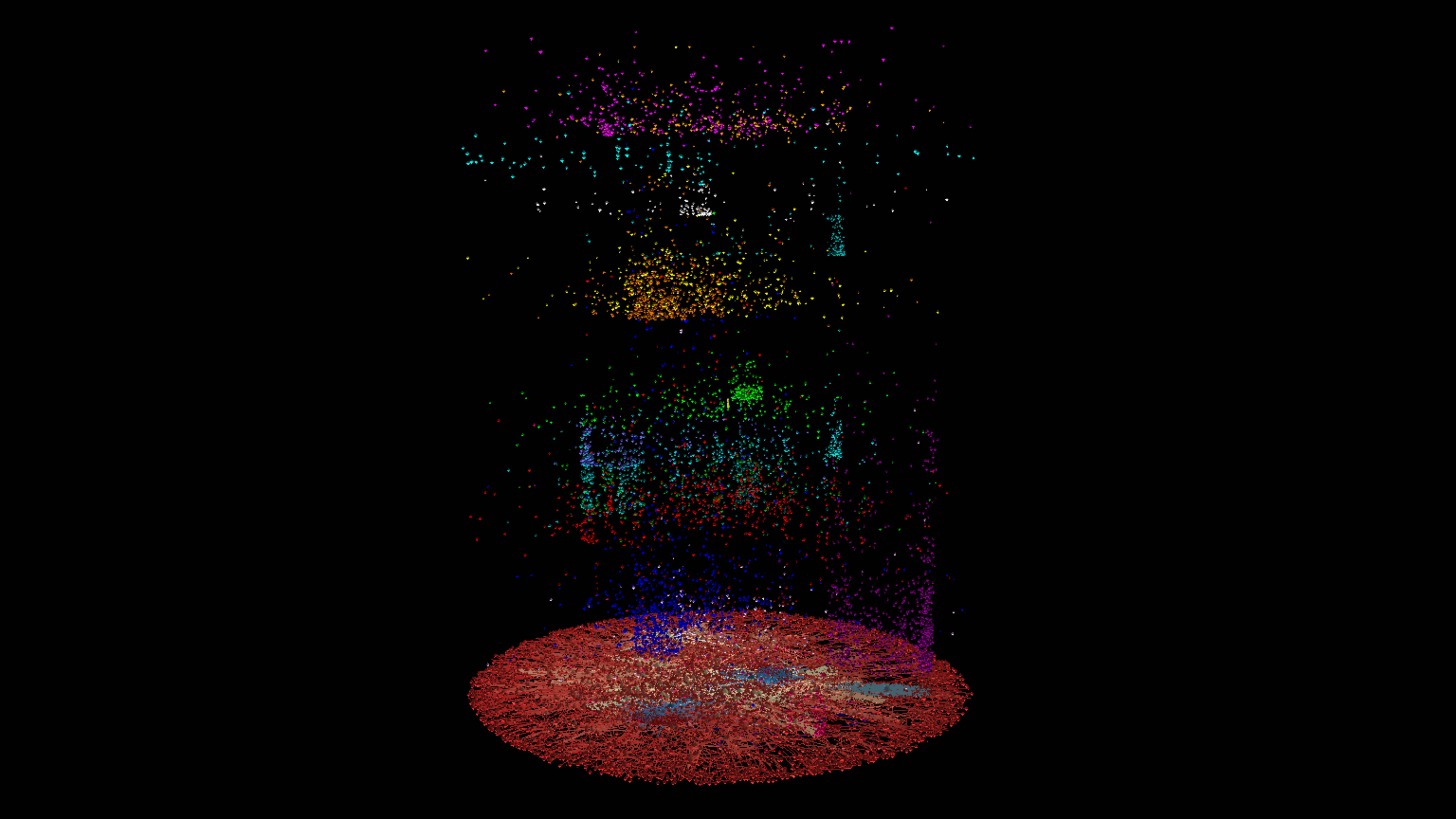
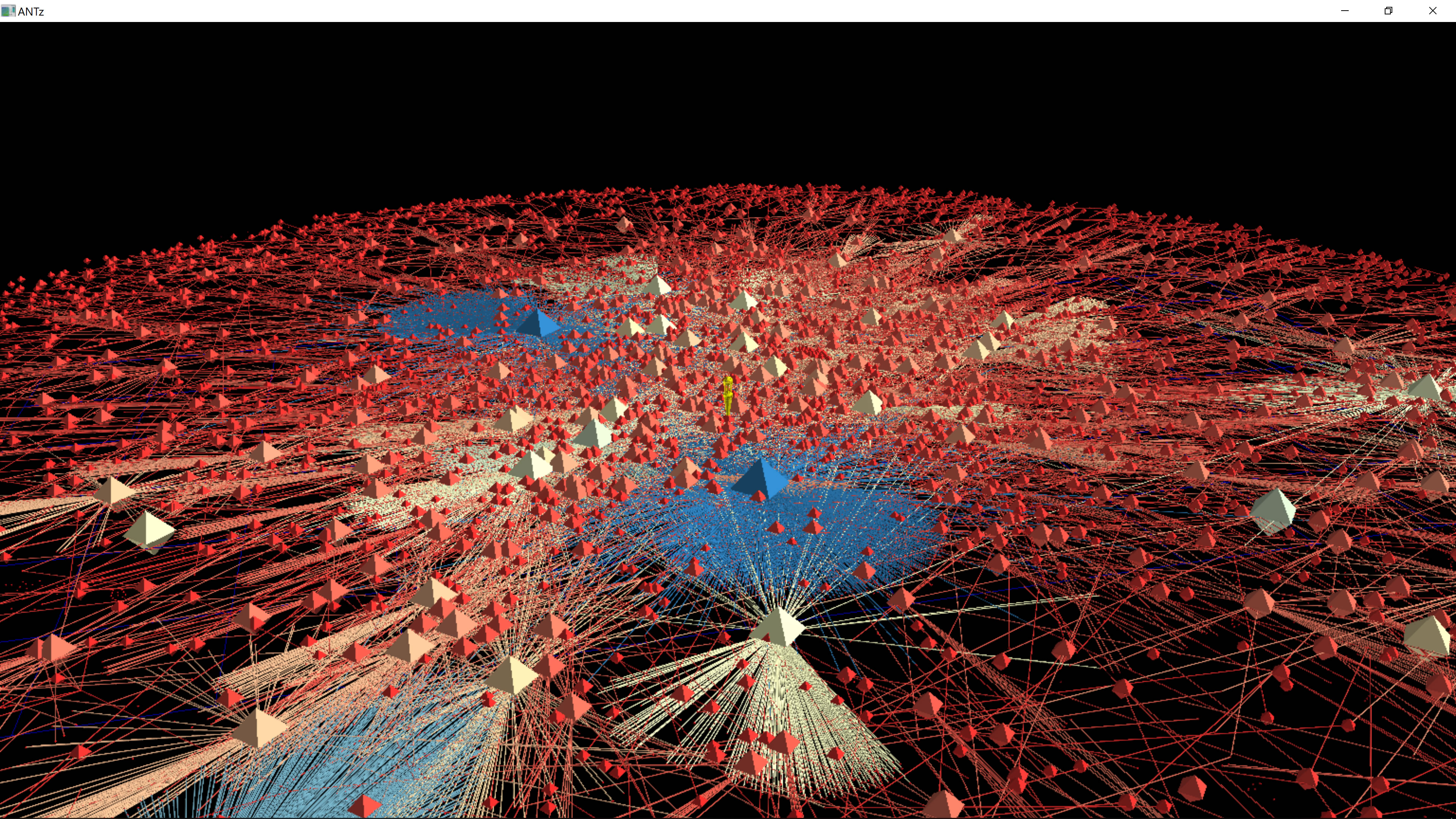
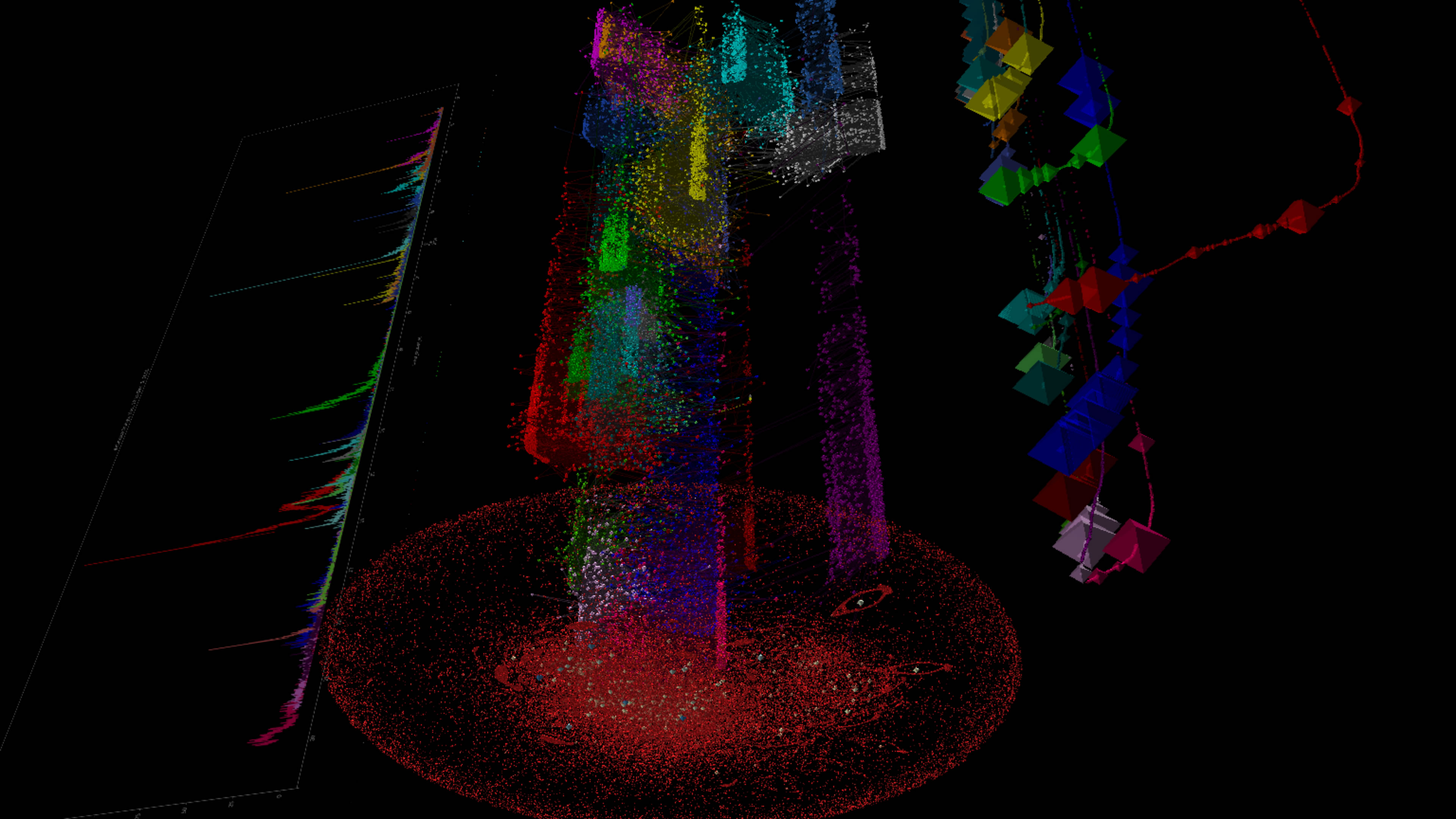
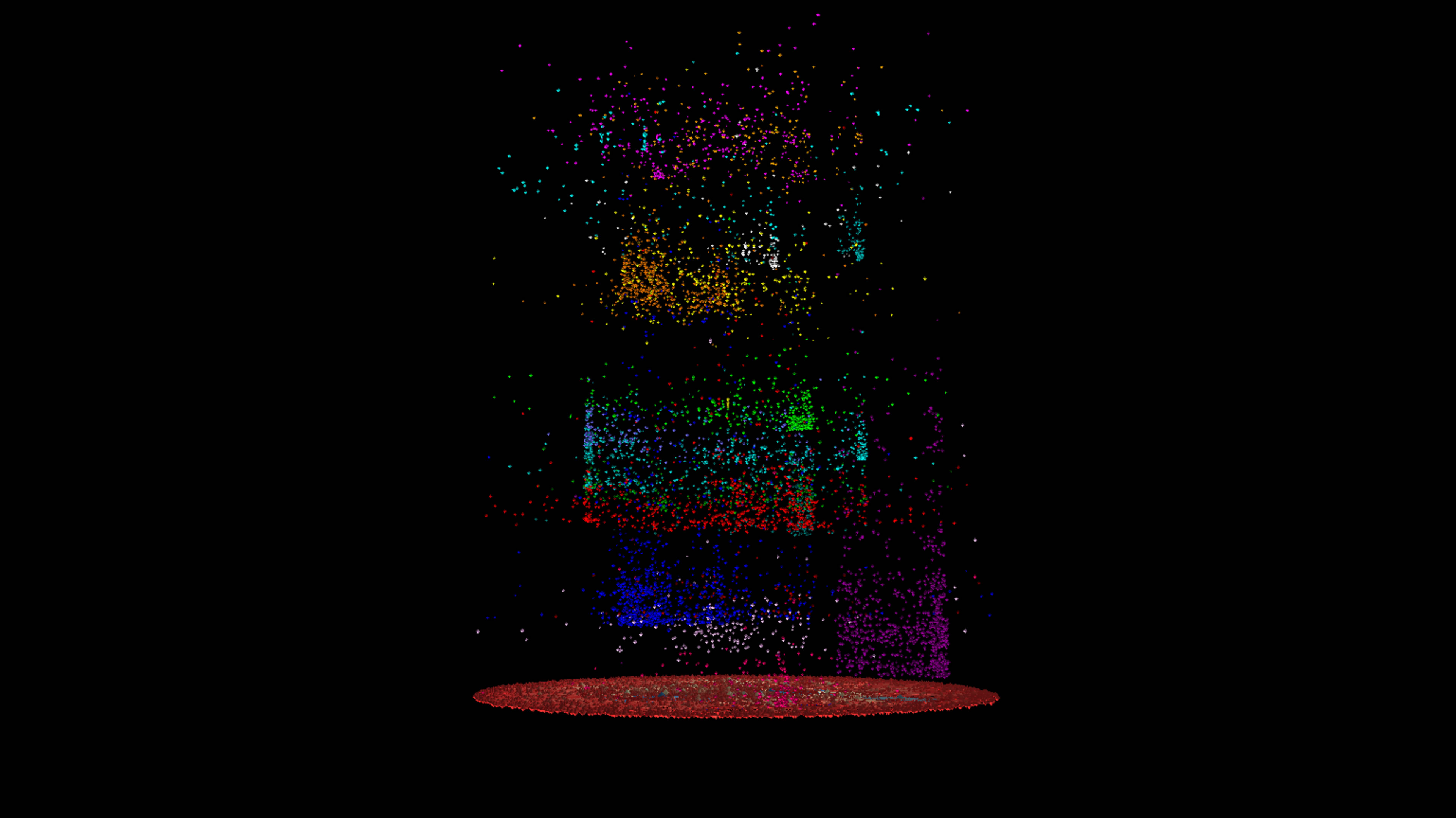
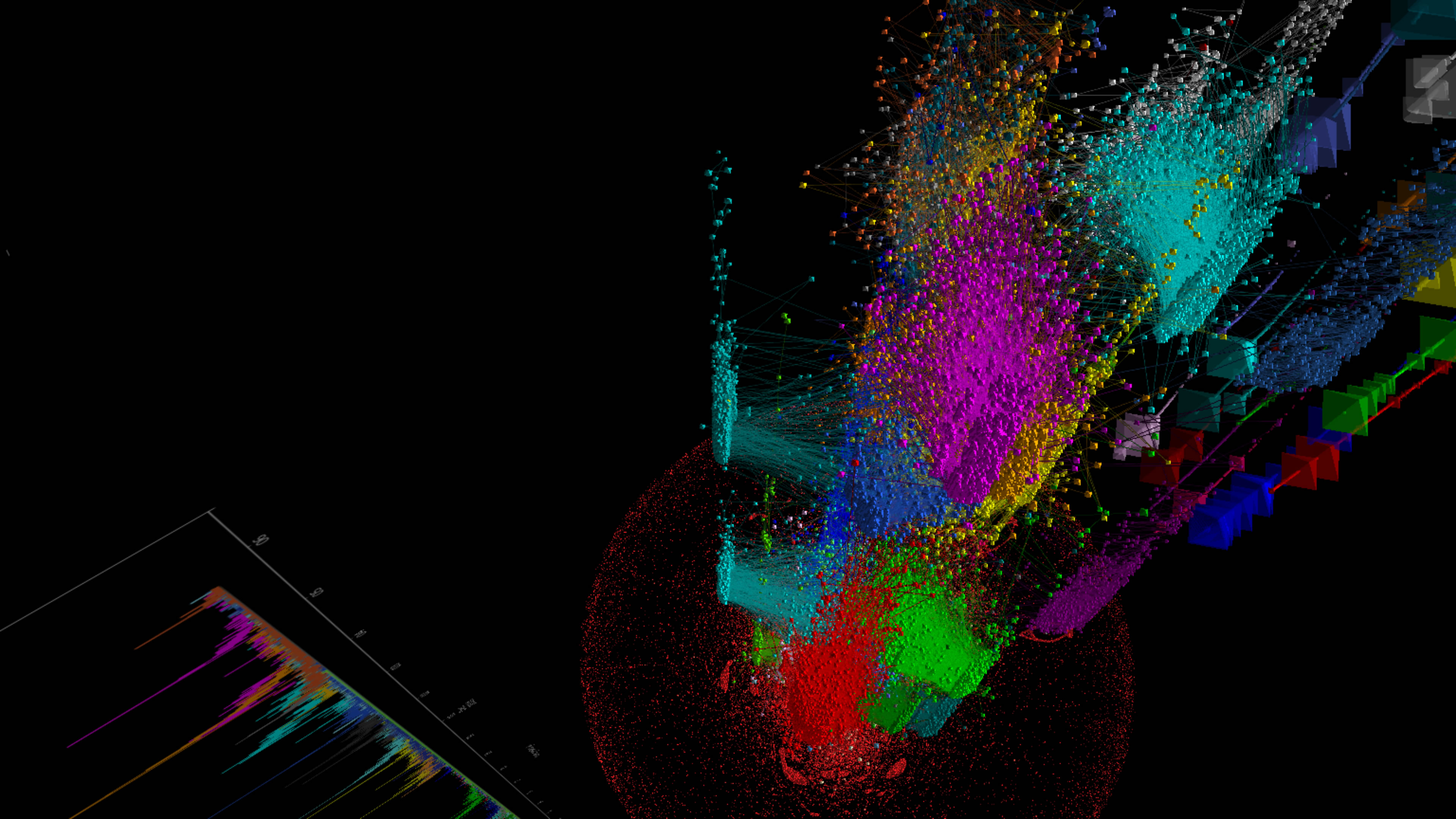
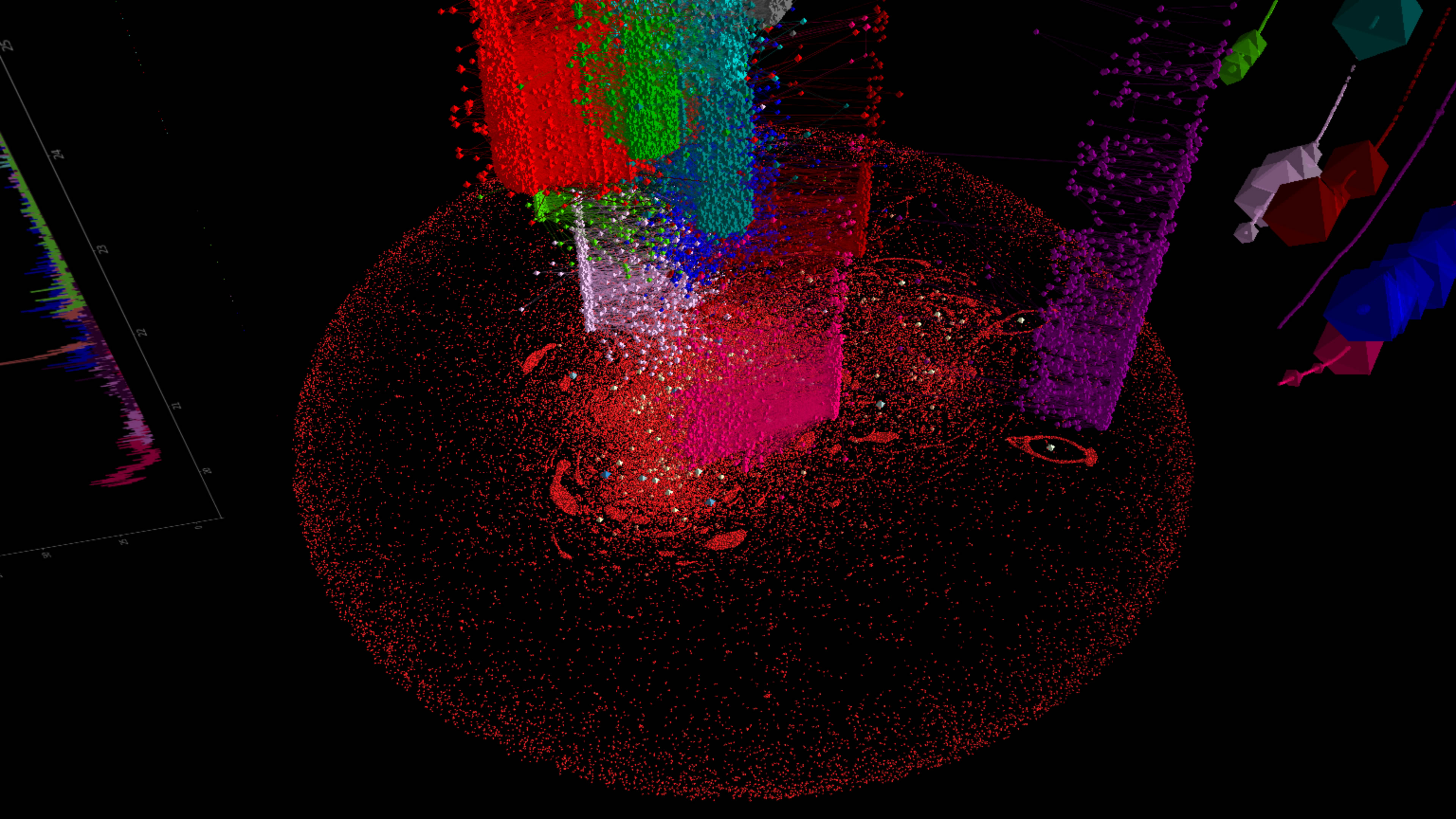
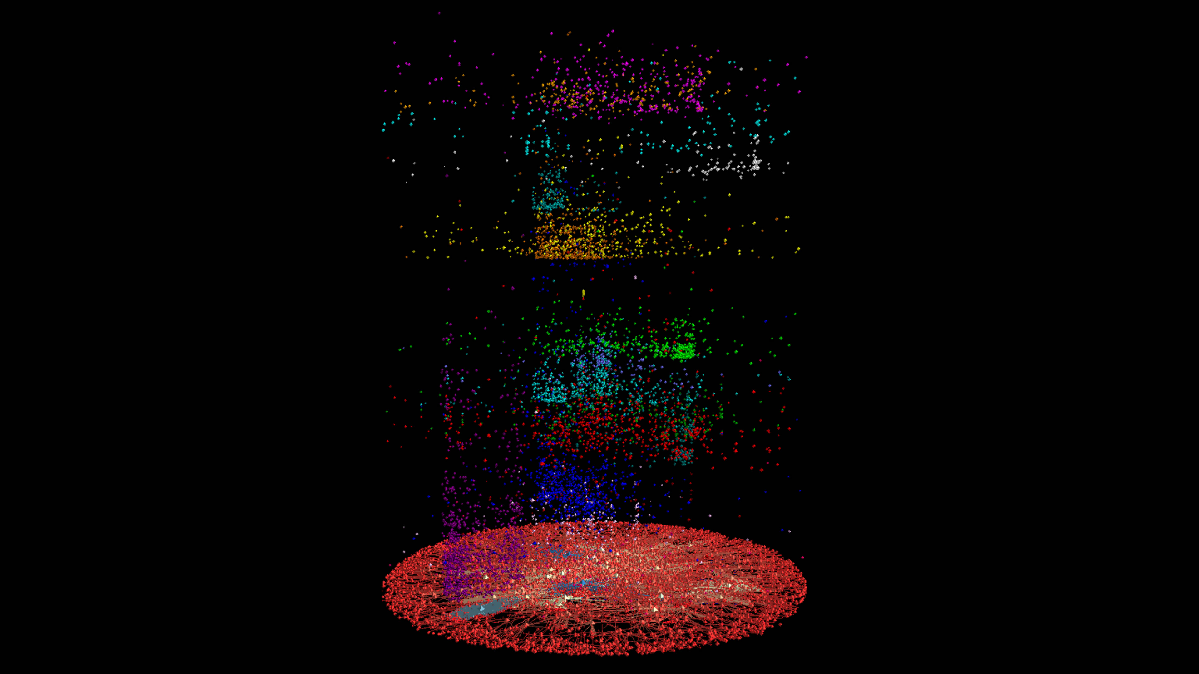
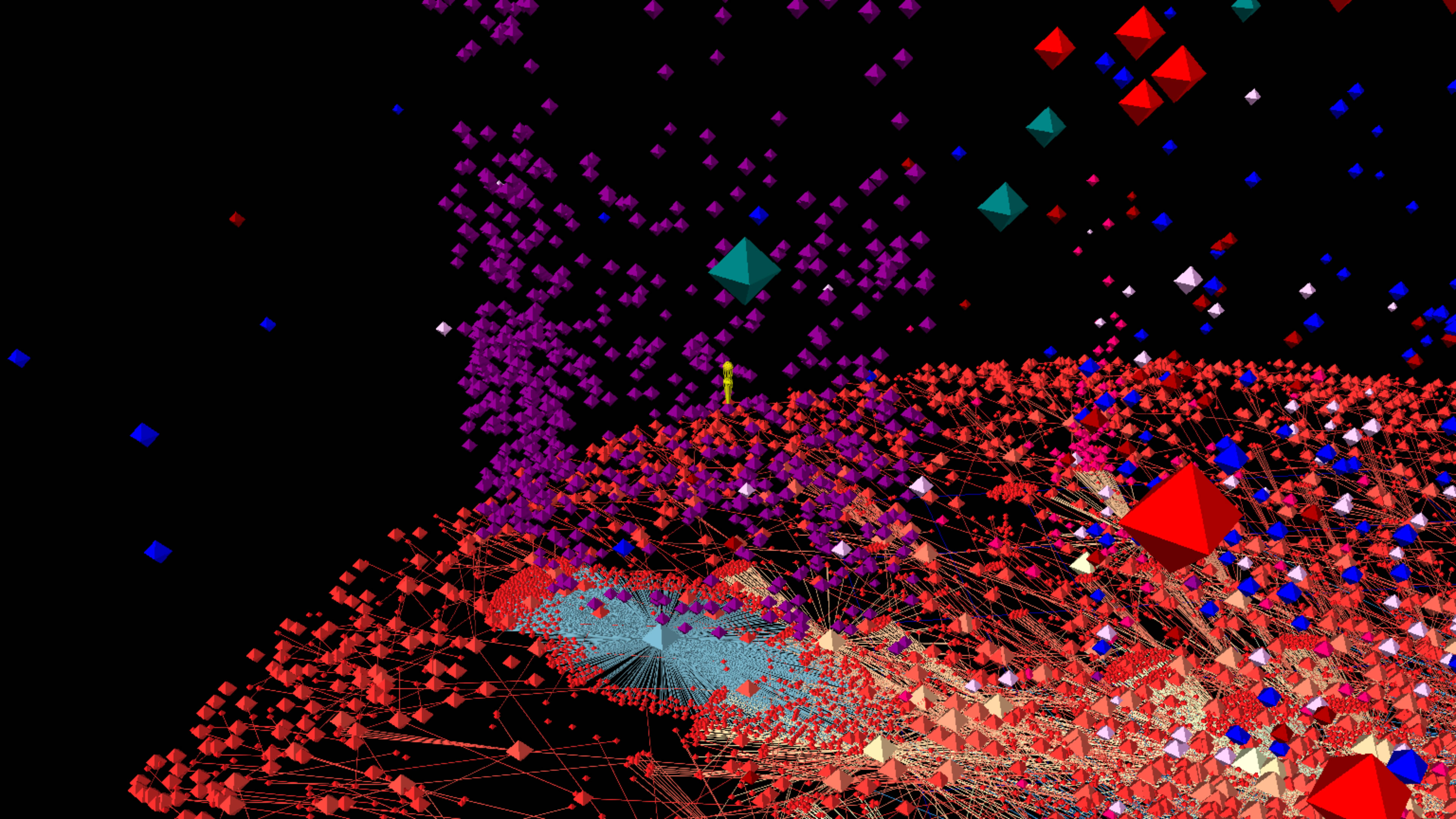
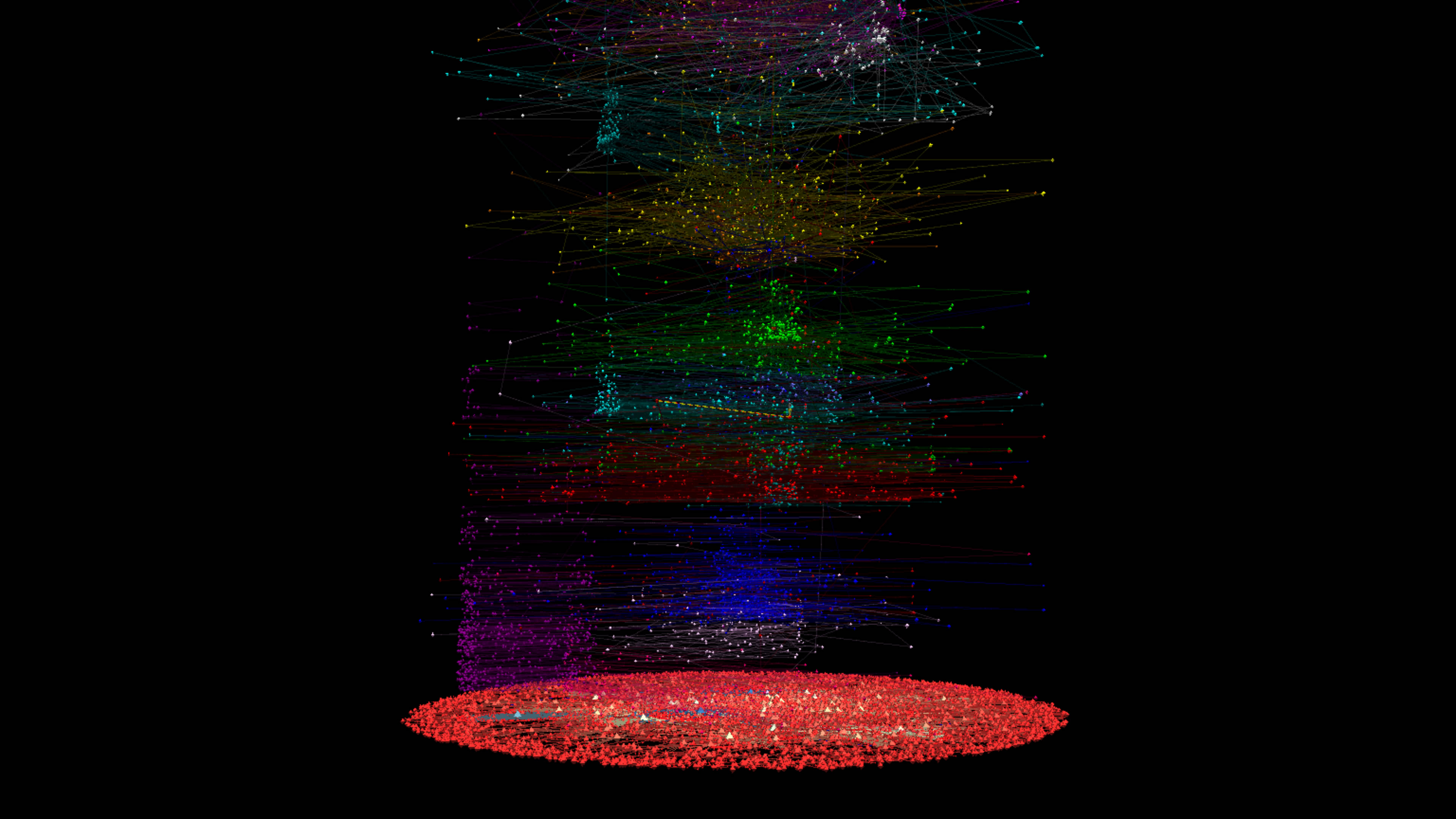
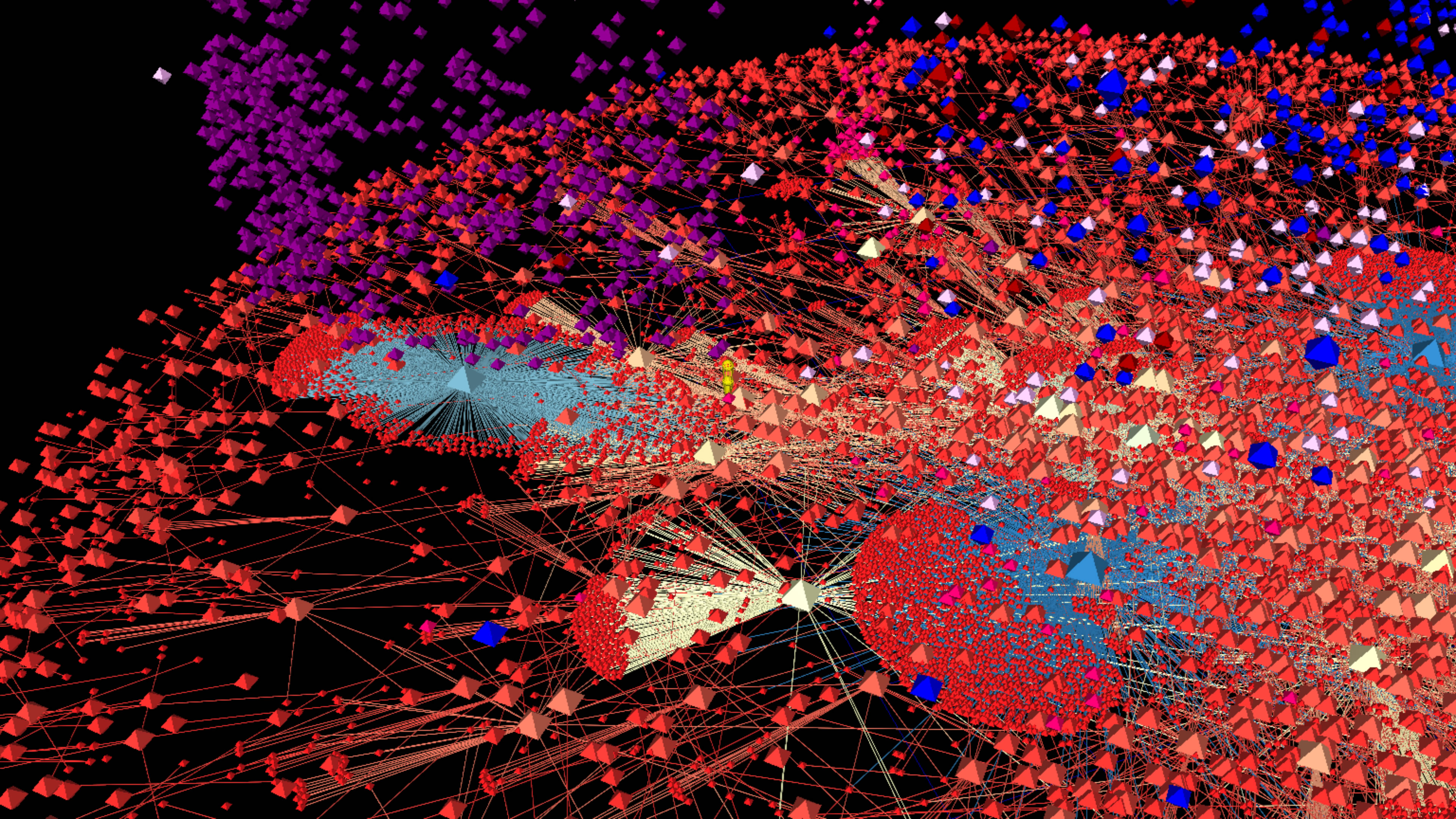
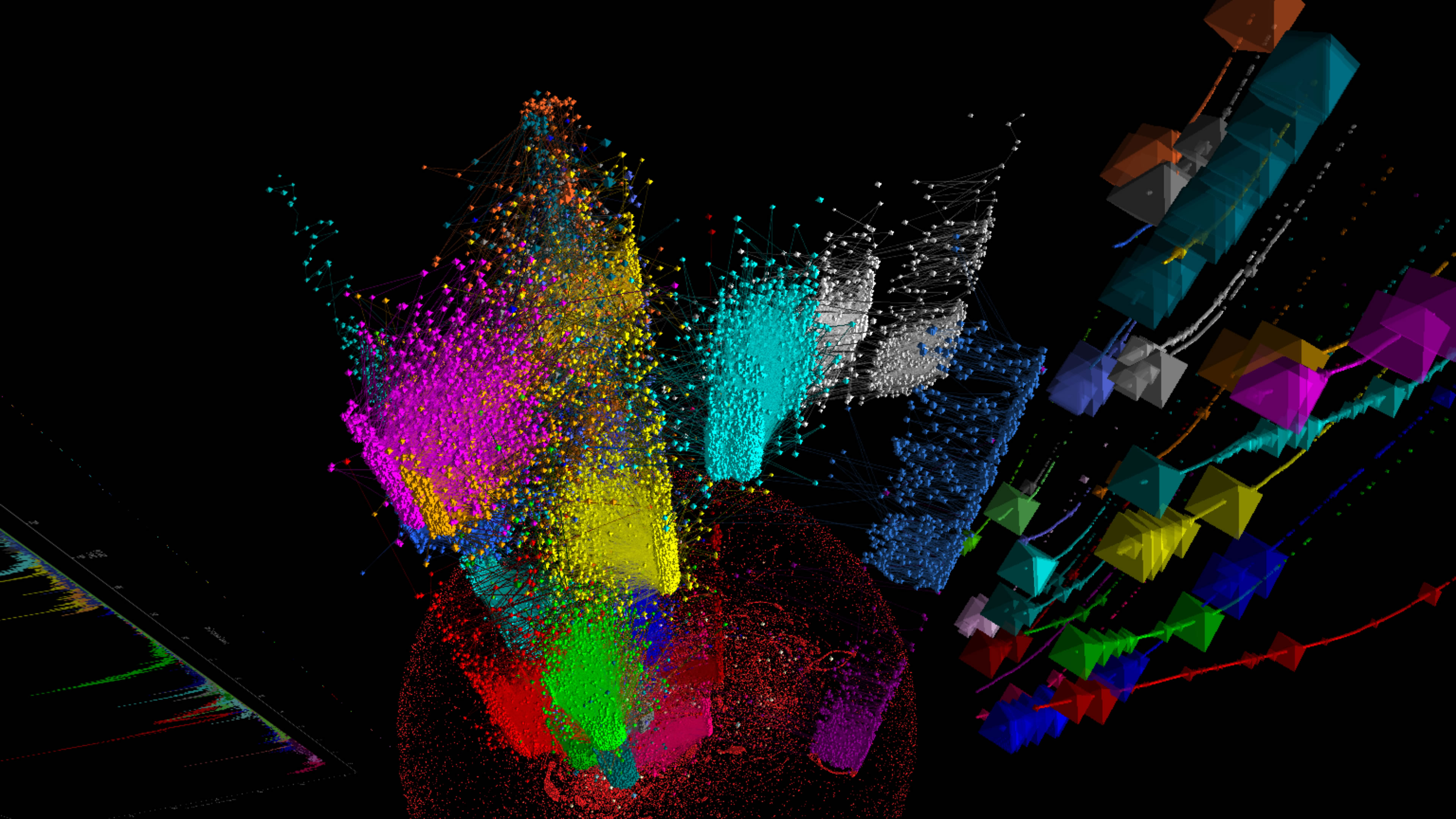
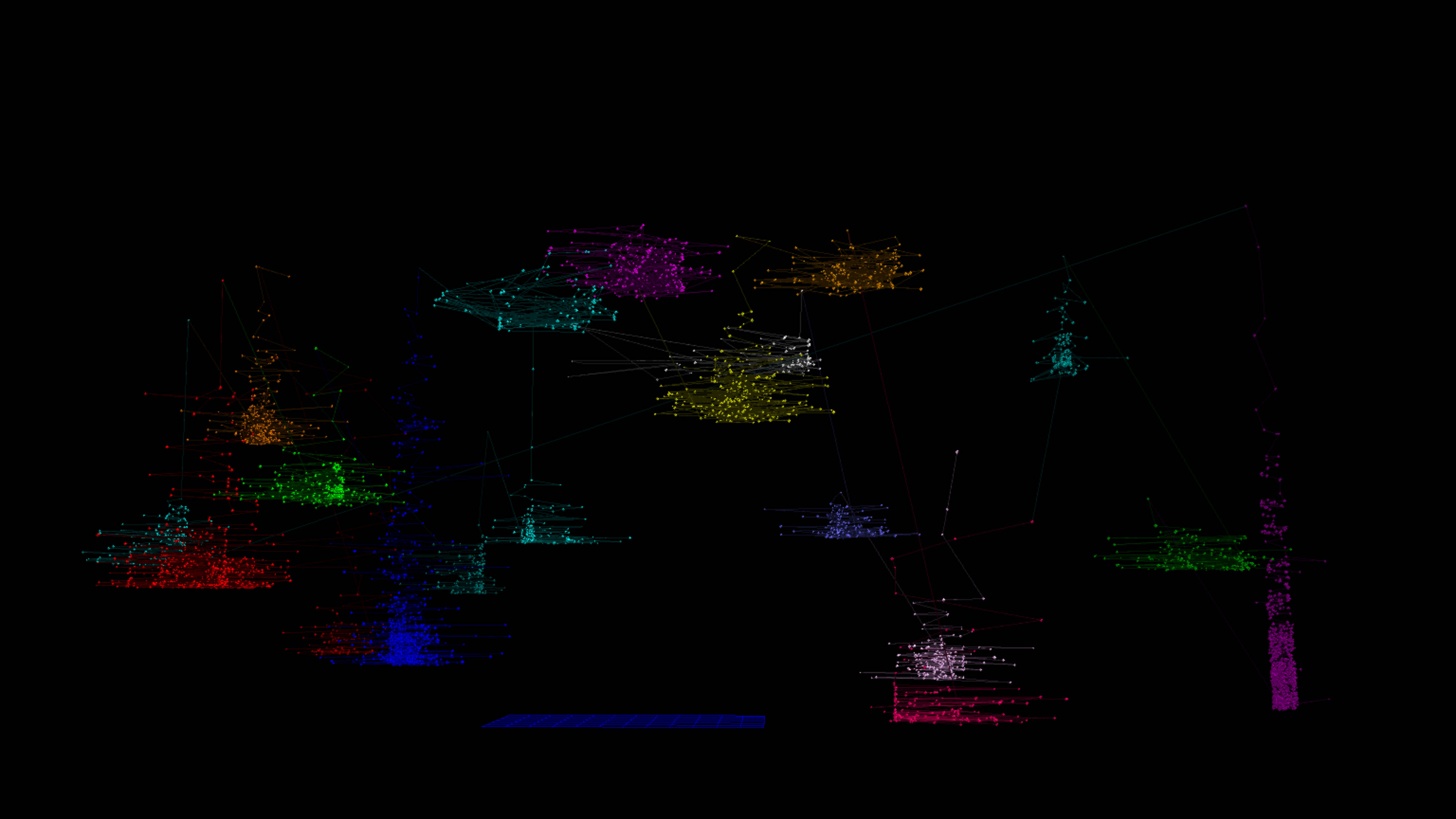
3D ANTz Visualizations
I generated a graph using Gephi and exported the xy coordinates as a spreadsheet and wrote some code to convert the data to the ANTz CSV format. Below is a spatiotemporal visualization of the top 20 tweets from the dataset.

Click the image below to view an animation of the 3D dataset rotating in ANTz.
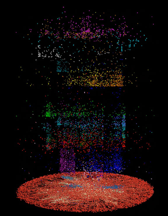
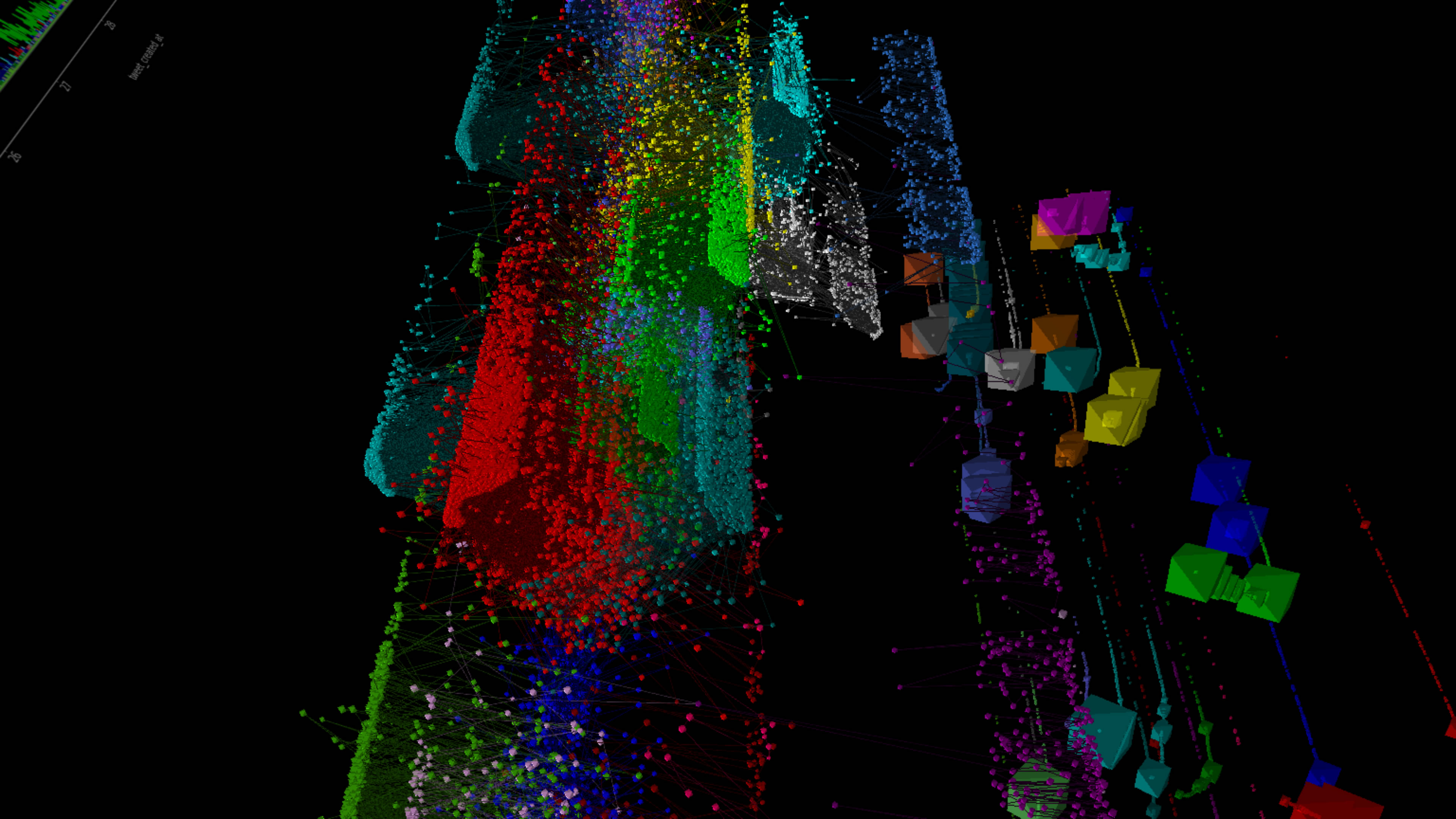
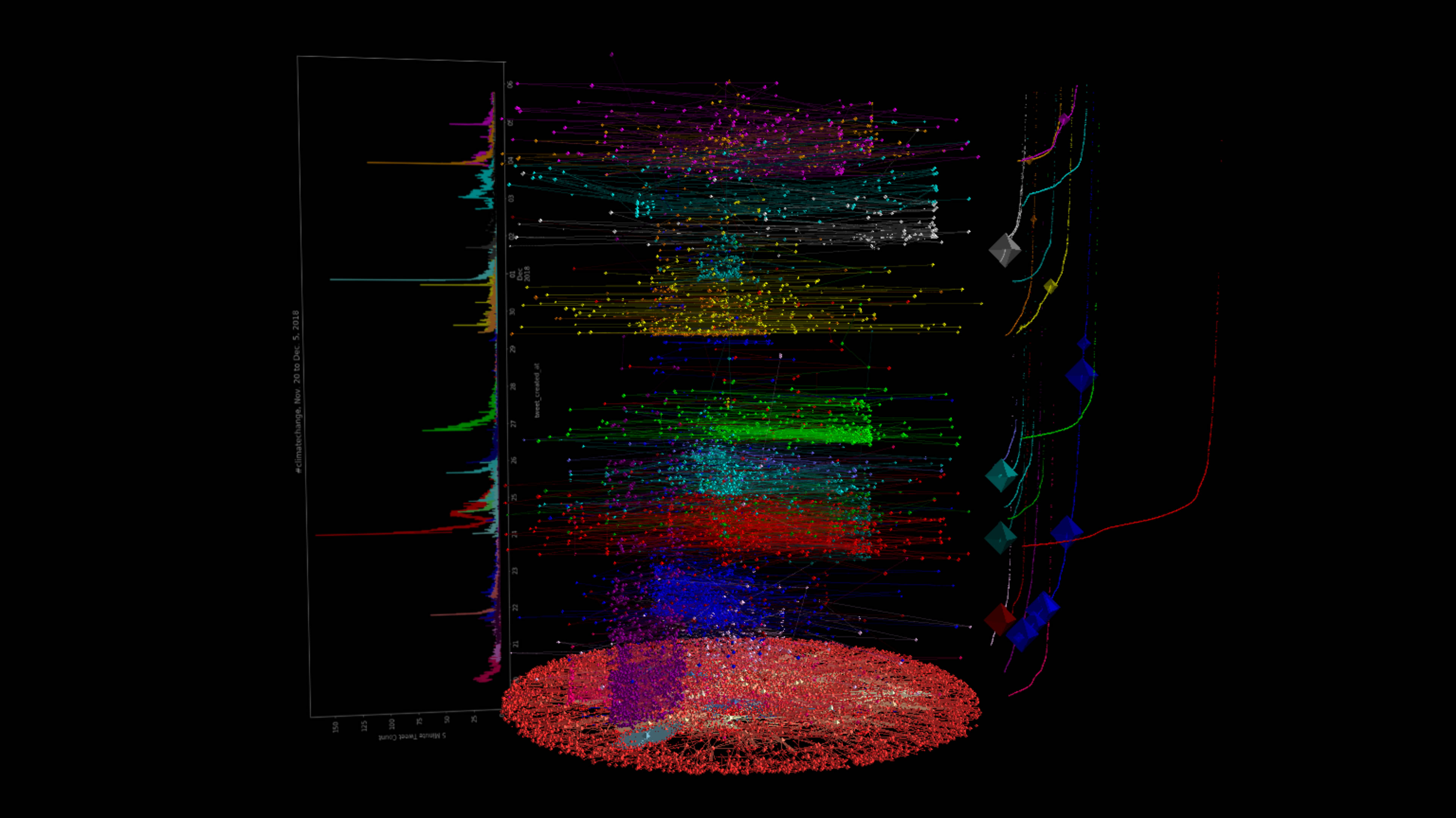
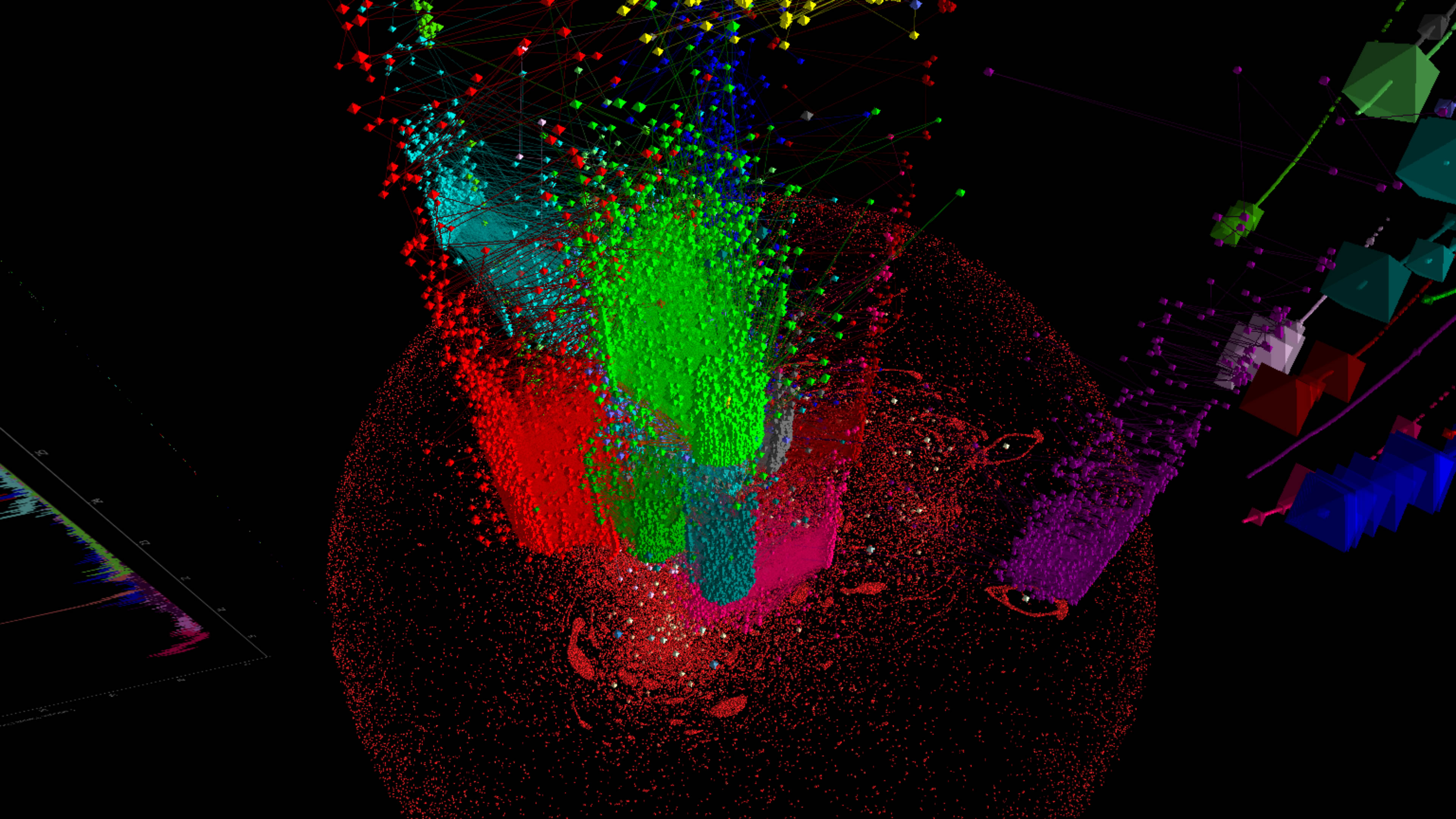
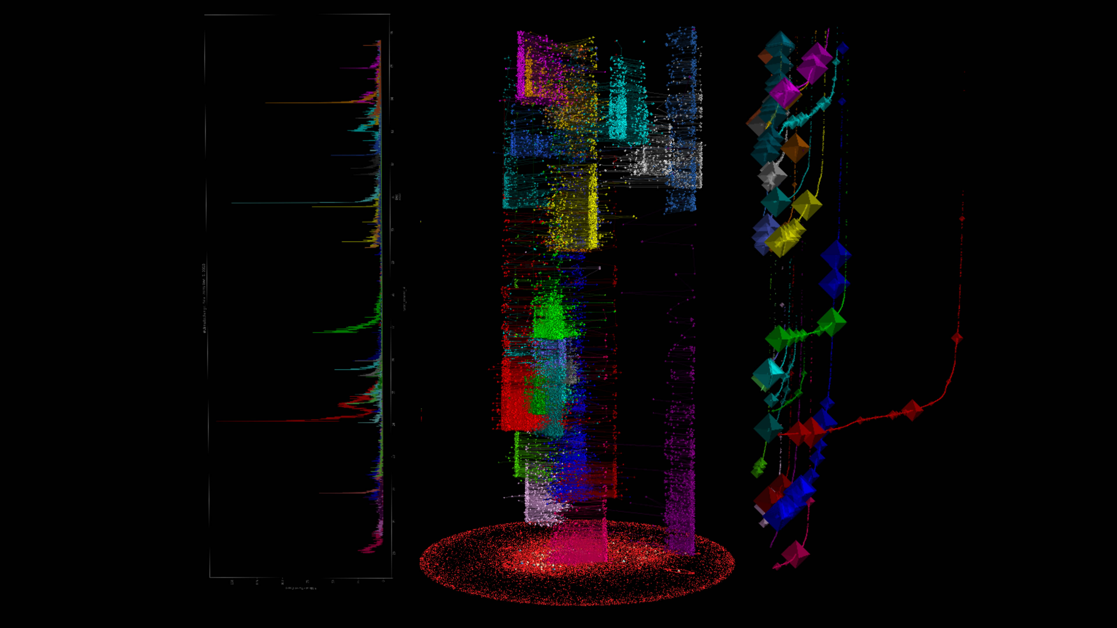
Finally, I wrote some code to merge all three types of visualizations into a single interactive 3D visualization with ANTz. The images below consist of a vertical timeline with the graph and individual color-coded retweet groups in the middle, and the frequency plots on one side and the cumulative plots on the other.