The high-level objective of this research was to better understand how our electricity is generated and consumed and how SDG&E manages that data somewhat arbitrarily.
Problems With Our SDG&E Usage Data
There is a problem with our SDG&E usage data, most likely because of a failed residential meter. I contacted SDG&E Customer Service, and they were very kind and concurred with me that the data was wrong and scheduled a repair asap. They also mentioned that our meter had been flagged for repair already. It failed four months ago. What took them so long? Once I contacted them the repair was done 3 business days later, which is nice, but this problem is not fully resolved.
Because SDG&E kindly provides online access to residential usage data, I downloaded the “Green Button” usage data from the web site and used data visualization tools to plot the electricity data over time. Here is what I found. Figure 1 below is a time series plot of solar electricity generation for the first four months of 2024. This was where I first observed the repeating patterns. The second half shows a repeating pattern a bit more clearly than the first half, but they both indicate that the data is repeating weekly. From January to mid-March there is one repeating pattern, then March 12-15 are identical days, then a new weekly pattern emerges for the remainder of the plot.
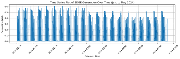
Figure 1: SDGE Data for Solar Generation, Jan. 1 to May 2, 2024
Figures 2 and 3 below compare two weeks of solar electricity generation for April 3-9 and April 10-16. It is clear they are identical data, and the numbers in the downloaded spreadsheet confirm that.
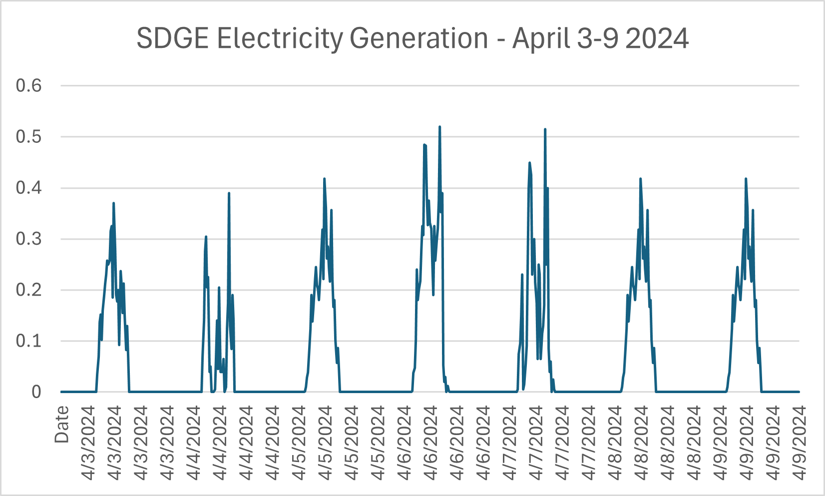
Figure 2: SDGE Solar Electricity Generation, Apr. 3-9, 2024
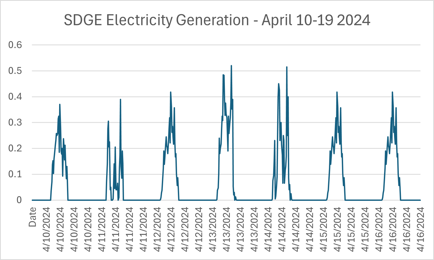
Figure 3: SDGE Solar Electricity Generation, Apr. 10-19, 2024
Figure 4 below shows the four identical days in a row, March 12-15.
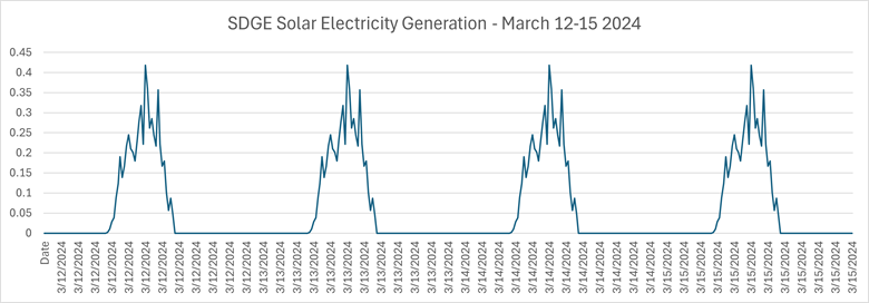
Figure 4: SDGE Solar Generation, Mar. 12-15, 2024
What kind of meter does this? What kind of corrupt data management policy is this? To get a better overview of longer time periods with greater temporal detail, I can use a style of visualization called a ‘heat map’. In Figure 5 below, I use this style to plot net hourly energy usage for the month of March 2024. Highlighted in the green rectangle are the four identical days in a row. Highlighted in the yellow rectangles are the first two of several identical weeks of net usage.
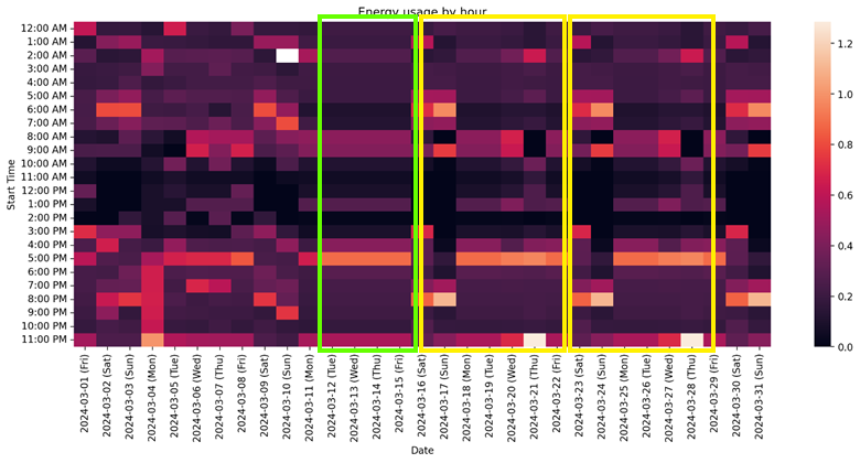
Figure 5: SDGE Solar Generation, Mar. 1 to Mar. 31, 2024, highlighting the repeated four days, March 12-15.
Figure 6 below visualizes daily net energy usage for 2024 to date. I can clearly see the repeating weekly pattern for the first 10 weeks, then something happens, perhaps the meter briefly recovers, then the four repeating days, then a new repeating weekly pattern.
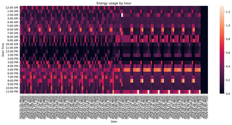
Figure 6: SDGE Solar Generation, Jan. 1 to May 2, 2024
Figure 7 below shows all available data on energy usage by hour from May 1, 2023, to May 31, 2024. From May to December 2023, I observe a relatively normal pattern of consumption with December being especially high because of Christmas lights. Then I see the first weekly pattern for January/February 2024, then the second weekly pattern for mid-March to mid-May 2024, then the meter is restored, and I see a relatively normal pattern of consumption again for the last two weeks.
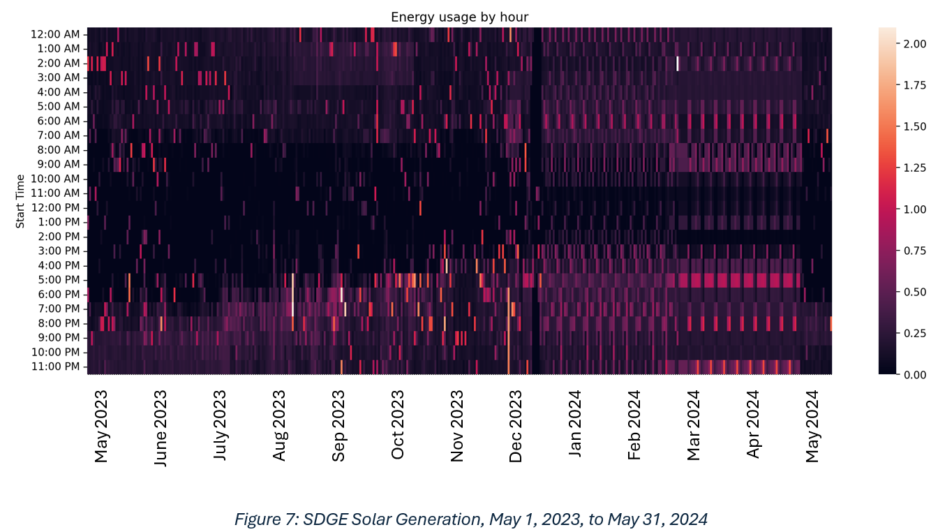
Figure 7: SDGE Solar Generation, May 1, 2023, to May 31, 2024
To reinforce this point, Figure 8 below shows a 10-day moving average. With the exception of the month of December, our typical usage is at or below 20 kWh with the exception of the corrupt data in the repeated weeks.
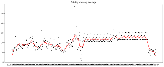
Figure 8: 10-Day Moving Average, May 2023 to May 2024
The meter was restored on May 14. We can clearly see that our typical net usage during spring is far lower than the repeating weeks from January to May 2024. I hope there is a way SDG&E may be able to recover the real data so we can resolve this fairly but whether or not, I hope there will be some form of credit or compensation as a result.
The difference between what the SDG&E solar electricity generation shows and what the Enphase data shows is significant. Figures 9 and 10 below make this clear. Figure 9 shows the actual energy generation during one of the worst weeks in March 2024, and it is still nearly three times more than the corresponding week of data from the SDG&E Green Button data. I expect this to be the case with all the data during the first 4-1/2 months of 2024.
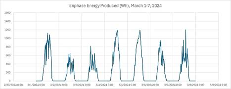
Figure 9: Enphase Energy Produced, March 1-7, 2024
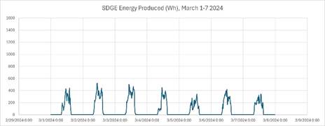
Figure 10: SDG&E Energy Produced, March 1-7, 2024
Finally, Figure 11 below shows our solar energy production data for the past seven years. In 2023 we increased the size of our solar panel array, and in April of 2024 we cut down a tree which cast significant shade during the morning. Now we are generating record amounts of daily energy, so it was difficult to understand why our bills have skyrocketed, but now it is obvious.
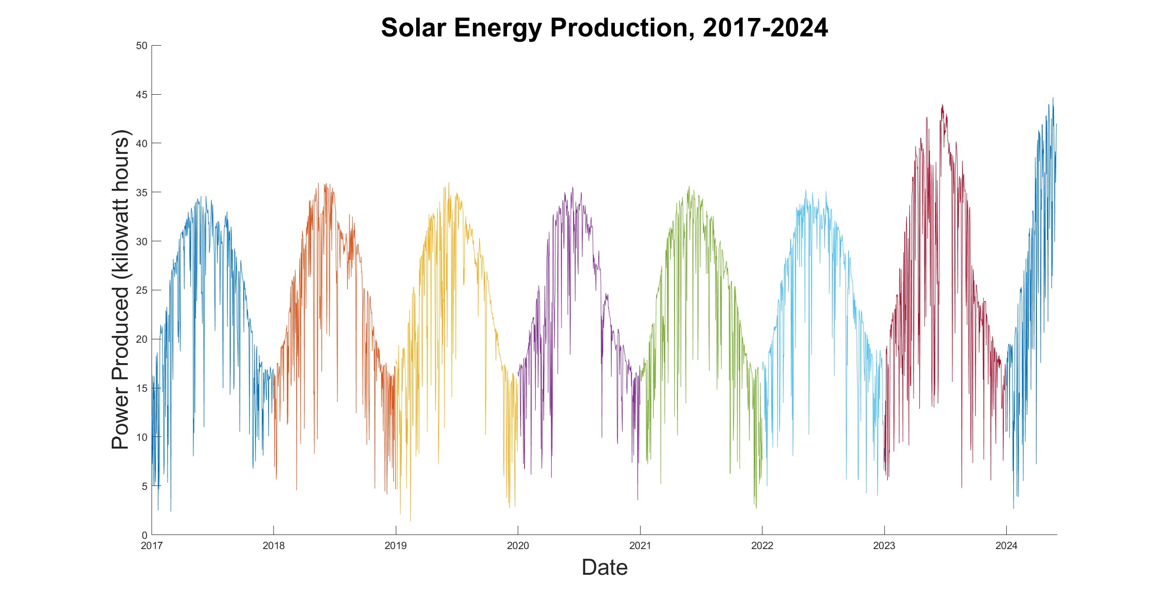
Figure 11: Enphase Solar Energy Production 2017-2024
It should be clear that we were significantly overcharged for our usage during the period from January to mid-May 2024. I hope that this study will convince the viewer of the significance and seriousness of the problem. I will be contacting them some time in the next week to attempt to resolve the overcharging issue once and for all. Wish me luck and check your meters!!
Problems With Our SDG&E Usage Data
There is a problem with our SDG&E usage data, most likely because of a failed residential meter. I contacted SDG&E Customer Service, and they were very kind and concurred with me that the data was wrong and scheduled a repair asap. They also mentioned that our meter had been flagged for repair already. It failed four months ago. What took them so long? Once I contacted them the repair was done 3 business days later, which is nice, but this problem is not fully resolved.
Because SDG&E kindly provides online access to residential usage data, I downloaded the “Green Button” usage data from the web site and used data visualization tools to plot the electricity data over time. Here is what I found. Figure 1 below is a time series plot of solar electricity generation for the first four months of 2024. This was where I first observed the repeating patterns. The second half shows a repeating pattern a bit more clearly than the first half, but they both indicate that the data is repeating weekly. From January to mid-March there is one repeating pattern, then March 12-15 are identical days, then a new weekly pattern emerges for the remainder of the plot.
Figure 1: SDGE Data for Solar Generation, Jan. 1 to May 2, 2024
Figures 2 and 3 below compare two weeks of solar electricity generation for April 3-9 and April 10-16. It is clear they are identical data, and the numbers in the downloaded spreadsheet confirm that.
Figure 2: SDGE Solar Electricity Generation, Apr. 3-9, 2024
Figure 3: SDGE Solar Electricity Generation, Apr. 10-19, 2024
Figure 4 below shows the four identical days in a row, March 12-15.
Figure 4: SDGE Solar Generation, Mar. 12-15, 2024
What kind of meter does this? What kind of corrupt data management policy is this? To get a better overview of longer time periods with greater temporal detail, I can use a style of visualization called a ‘heat map’. In Figure 5 below, I use this style to plot net hourly energy usage for the month of March 2024. Highlighted in the green rectangle are the four identical days in a row. Highlighted in the yellow rectangles are the first two of several identical weeks of net usage.
Figure 5: SDGE Solar Generation, Mar. 1 to Mar. 31, 2024, highlighting the repeated four days, March 12-15.
Figure 6 below visualizes daily net energy usage for 2024 to date. I can clearly see the repeating weekly pattern for the first 10 weeks, then something happens, perhaps the meter briefly recovers, then the four repeating days, then a new repeating weekly pattern.
Figure 6: SDGE Solar Generation, Jan. 1 to May 2, 2024
Figure 7 below shows all available data on energy usage by hour from May 1, 2023, to May 31, 2024. From May to December 2023, I observe a relatively normal pattern of consumption with December being especially high because of Christmas lights. Then I see the first weekly pattern for January/February 2024, then the second weekly pattern for mid-March to mid-May 2024, then the meter is restored, and I see a relatively normal pattern of consumption again for the last two weeks.
Figure 7: SDGE Solar Generation, May 1, 2023, to May 31, 2024
To reinforce this point, Figure 8 below shows a 10-day moving average. With the exception of the month of December, our typical usage is at or below 20 kWh with the exception of the corrupt data in the repeated weeks.
Figure 8: 10-Day Moving Average, May 2023 to May 2024
The meter was restored on May 14. We can clearly see that our typical net usage during spring is far lower than the repeating weeks from January to May 2024. I hope there is a way SDG&E may be able to recover the real data so we can resolve this fairly but whether or not, I hope there will be some form of credit or compensation as a result.
The difference between what the SDG&E solar electricity generation shows and what the Enphase data shows is significant. Figures 9 and 10 below make this clear. Figure 9 shows the actual energy generation during one of the worst weeks in March 2024, and it is still nearly three times more than the corresponding week of data from the SDG&E Green Button data. I expect this to be the case with all the data during the first 4-1/2 months of 2024.
Figure 9: Enphase Energy Produced, March 1-7, 2024
Figure 10: SDG&E Energy Produced, March 1-7, 2024
Finally, Figure 11 below shows our solar energy production data for the past seven years. In 2023 we increased the size of our solar panel array, and in April of 2024 we cut down a tree which cast significant shade during the morning. Now we are generating record amounts of daily energy, so it was difficult to understand why our bills have skyrocketed, but now it is obvious.
Figure 11: Enphase Solar Energy Production 2017-2024
It should be clear that we were significantly overcharged for our usage during the period from January to mid-May 2024. I hope that this study will convince the viewer of the significance and seriousness of the problem. I will be contacting them some time in the next week to attempt to resolve the overcharging issue once and for all. Wish me luck and check your meters!!