Advanced Visualization of Angola Conflict, 1960 to 2002
Instructions to run the app:
Due to the large size of the dataset, it has been broken up into two different CSV files, 1) for years 1960-1994, and 2) for years 1995-2002. These files are named accordingly. There are two BATCH files (*.bat extension) for the two datasets. Double-click either to launch the app and load the data. Note that dataset 1 is nearly twice the size of dataset 2, so it loads quite slowly on slow systems. For this reason, load the smaller dataset for years 1995-2002 if you are working on a slow system. I am working on a form to submit your own queries for specific ranges of time. Review the legend and diagram below to better understand the format.
Color Legend
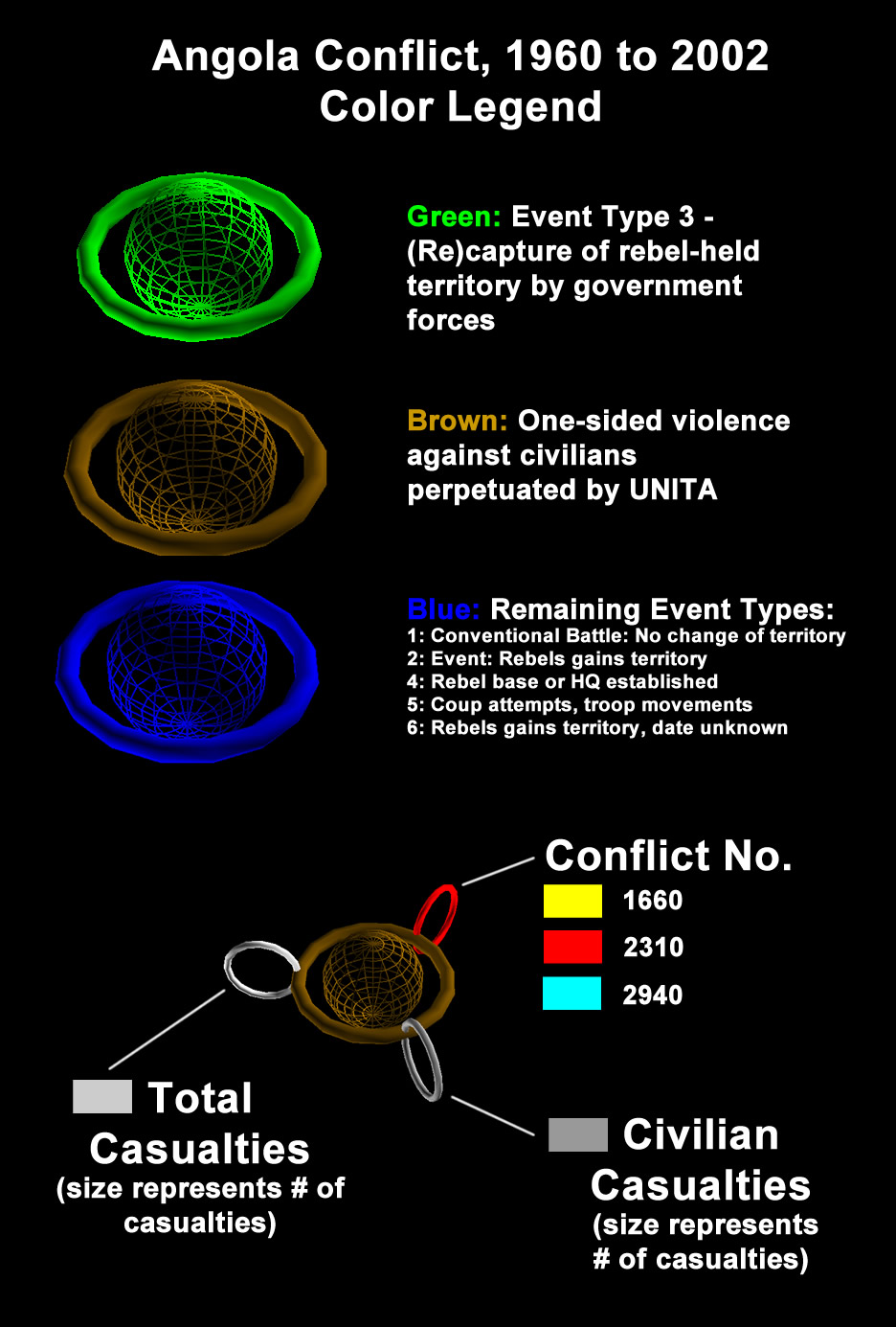
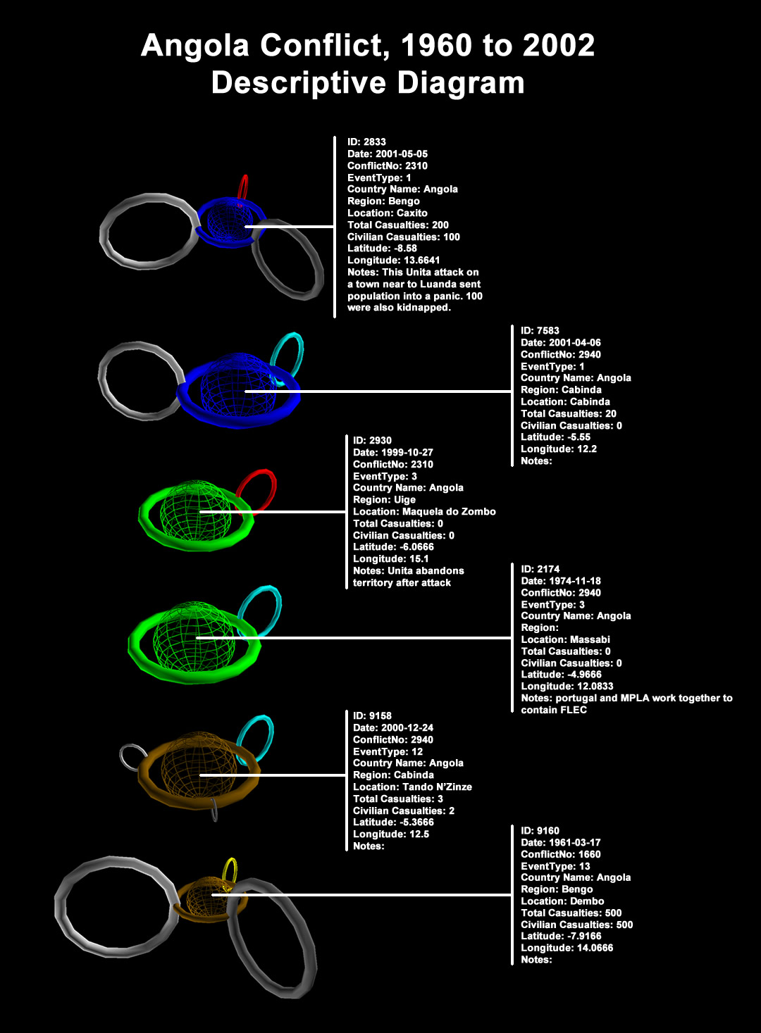
Diagram with Examples
Visualizations with Descriptions
Click images to enlarge them.
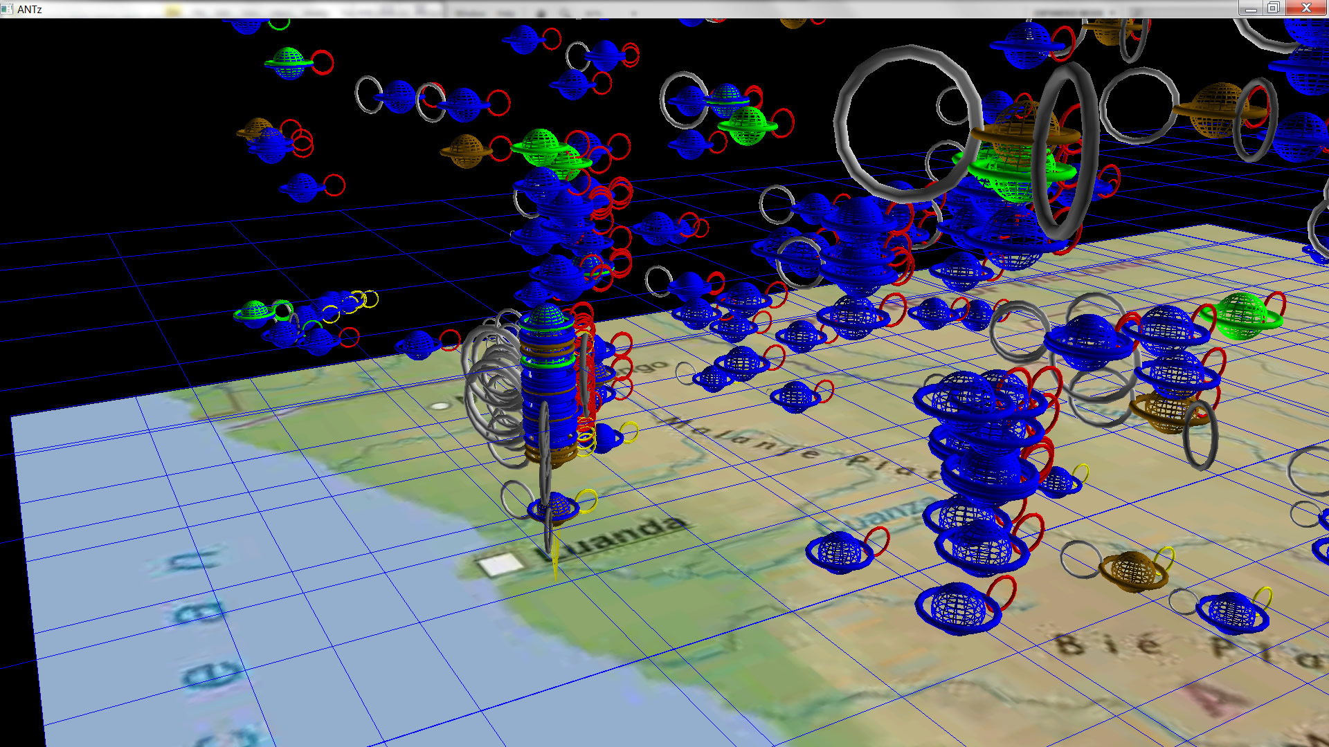
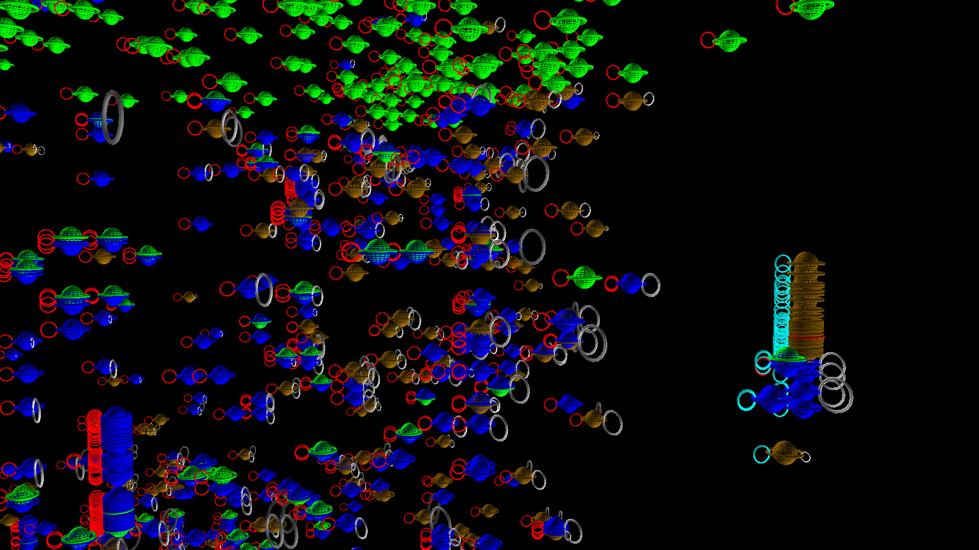
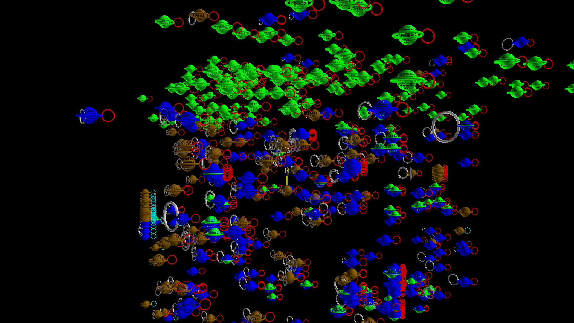
This is a view of the earliest part of the dataset with events from 1960 and later. Earlier toroids are lower, time increases upward.
We see a grouping of violent events (light and dark gray toroids) around Luanda.
Most of this dataset consists of conflict 2310 (red toroids), but some of the earliest conflicts were of conflict 1660 (yellow toroids). This conflict died out early.
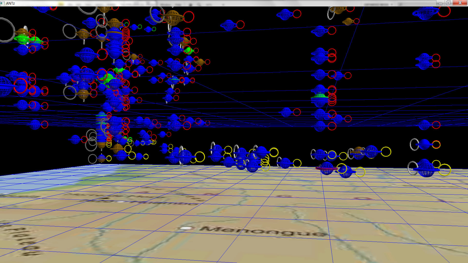
The light green layer represents a period throughout Angola of event type 3, a battle in which the government gains territory.
In the above images, the thick green layer at the top of this dataset represents events of type 3 around 2001-2002, the most recent data available from this set. Note also the effect viewing angle has on what can be observed. in the left image, we can see numerous light and dark gray toroids (casualties), but the red toroids representing conflict 2310 are barely visible. With a 60 degree rotation in view, the image on the right shows a significant increase in red toroids which are visible, and a significant reduction of the light and dark gray toroids visibility.
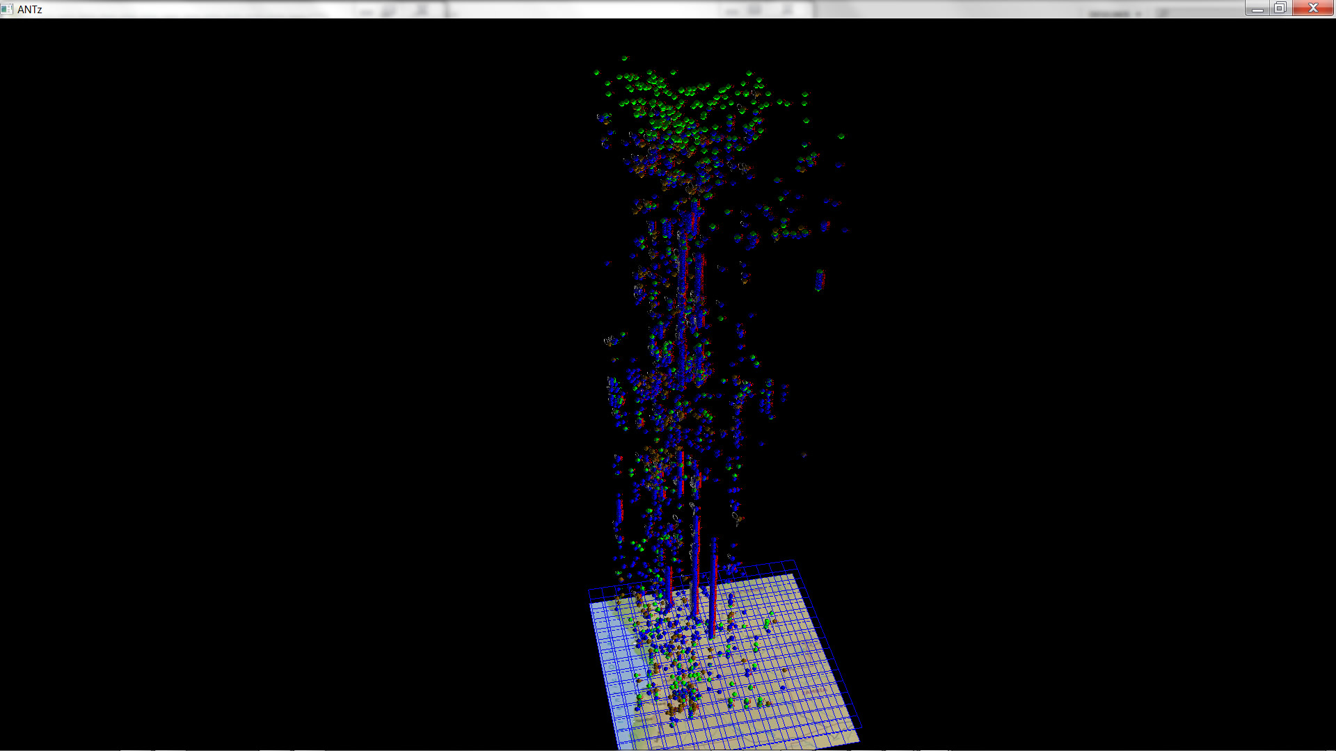
The above image shows an interesting variation in the nature and distribution of the dataset.
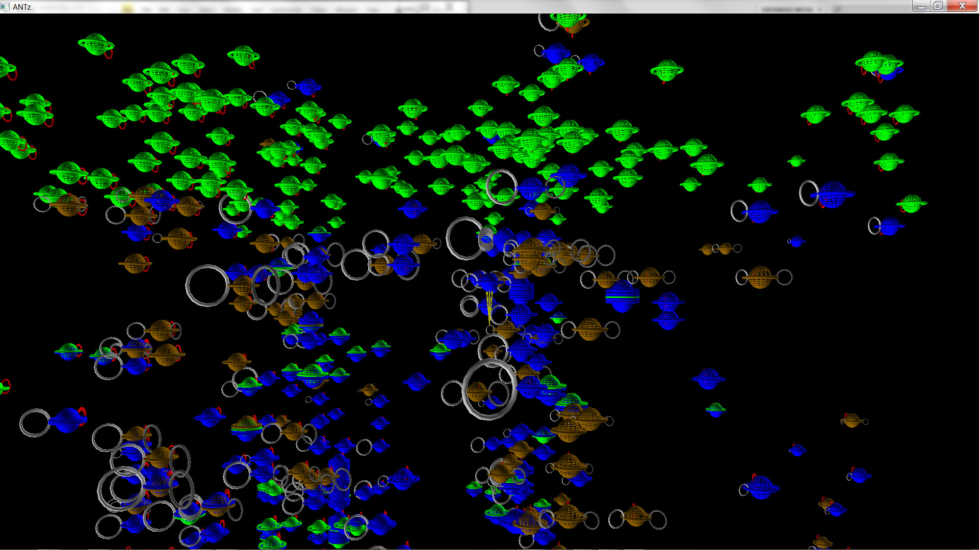
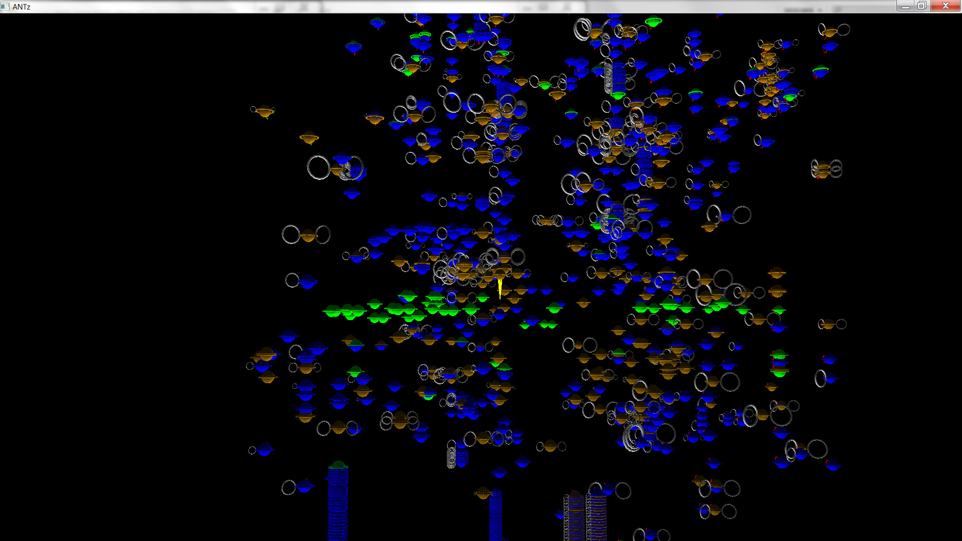
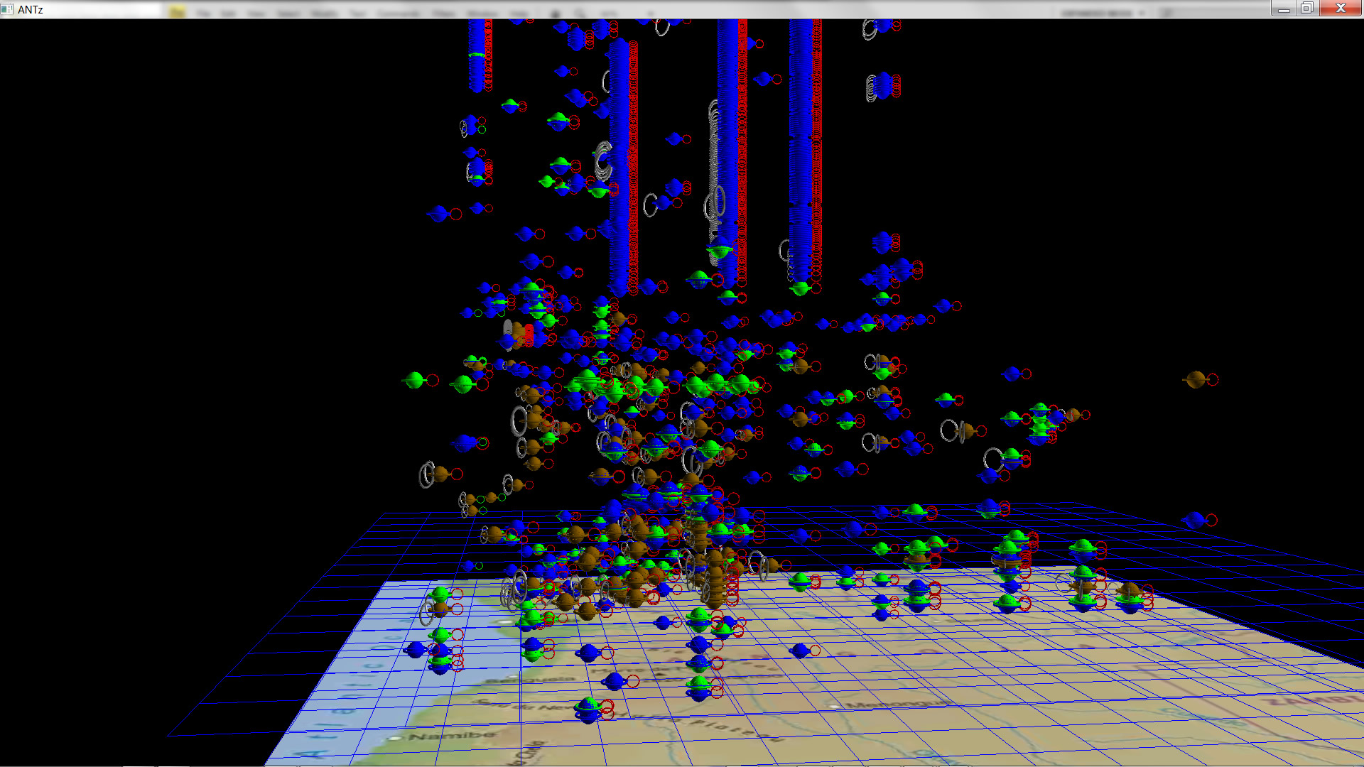
The above image is a zoomed-out view of the entire dataset for years 1995-2002.
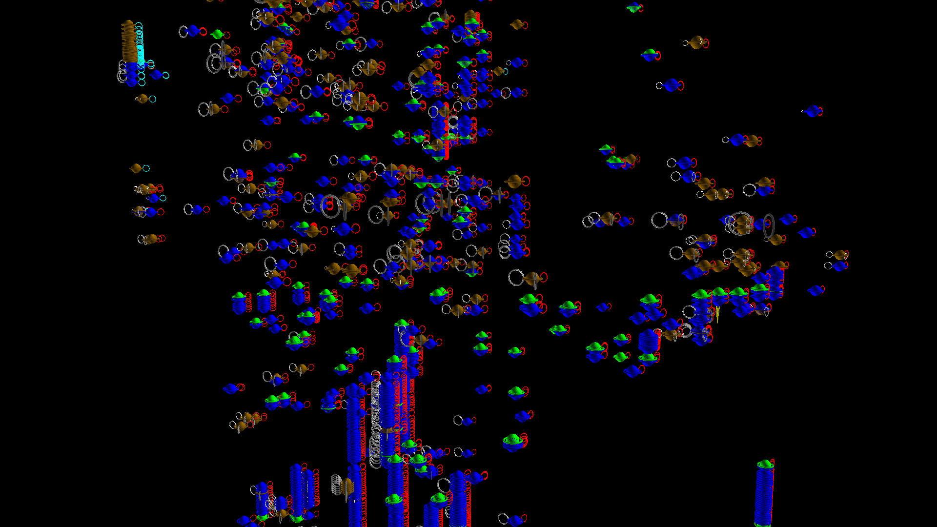
The images above are two different views of the uppermost data in the dataset for the years 1995-2002. On the left, in the upper left corner, we see a series of light cyan toroids representing an isolated conflict, #1660.
In the image on the right, a different angle of view shows the same conflict on the right.
Note another feature in the left image above: on the right and roughly in the middle there is a group of event type 3's (bright green) occuring roughly during the same time, followed by numerous event type 7's, i.e. the brown toroids above the row of green. This may be one example of atrocities following an event type 3 that Jen was looking for.